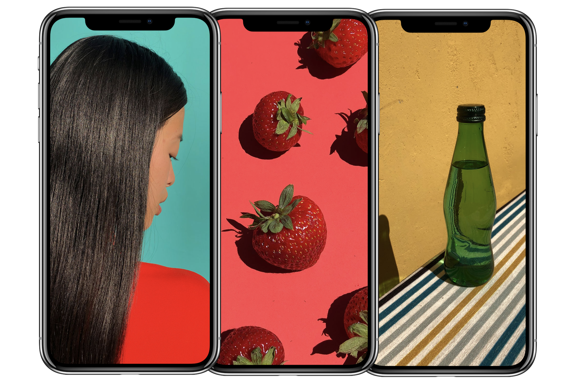
Apple held what may be remembered as its biggest event today at its new HQ in Cupertino to unveil 'the future.' That future comes ten years after Steve Jobs unveiled the original iPhone, which undoubtedly changed the world.
After leading up to the iPhone X unveiling for over an hour today, Apple certainly unveiled a vision of future but it was absolutely not a vision of what's next for anyone other than itself.
The iPhone X is an incredible phone if you look at what's crammed in there. It packs some of the most advanced technology available to mobile devices: an OLED screen, super-thin bezels, wireless charging, HDR and a massive front-facing camera array for augmented reality and unlocking.
Apple certainly achieved an impressive feat with the iPhone X, but as its slogan is "say hello to the future" almost all of those futuristic decisions appear to come with enormous compromises that I can't explain outside of assuming that they were a byproduct of these decisions.
2017 will certainly be remembered as the year of bezel-less phones. The technology behind OLED displays converged with new techniques for shrinking sensor arrays so small that it was actually feasible to pull off a near edge-to-edge display in a tiny rectangle.
Essential, a new entrant to the market, dropped a phone just a few weeks ago that pushed the limits of that rectangle form factor to slather it in display with one weird thing: an ugly (but small) cut-out for the front camera and ear phone.
Samsung's Galaxy S8, however, was actually first out the gate with an edge-to-edge screen and it didn't have any weird compromises to work around because it chose to remove the buttons and use a slightly thicker forehead at the top to disguise the cameras.
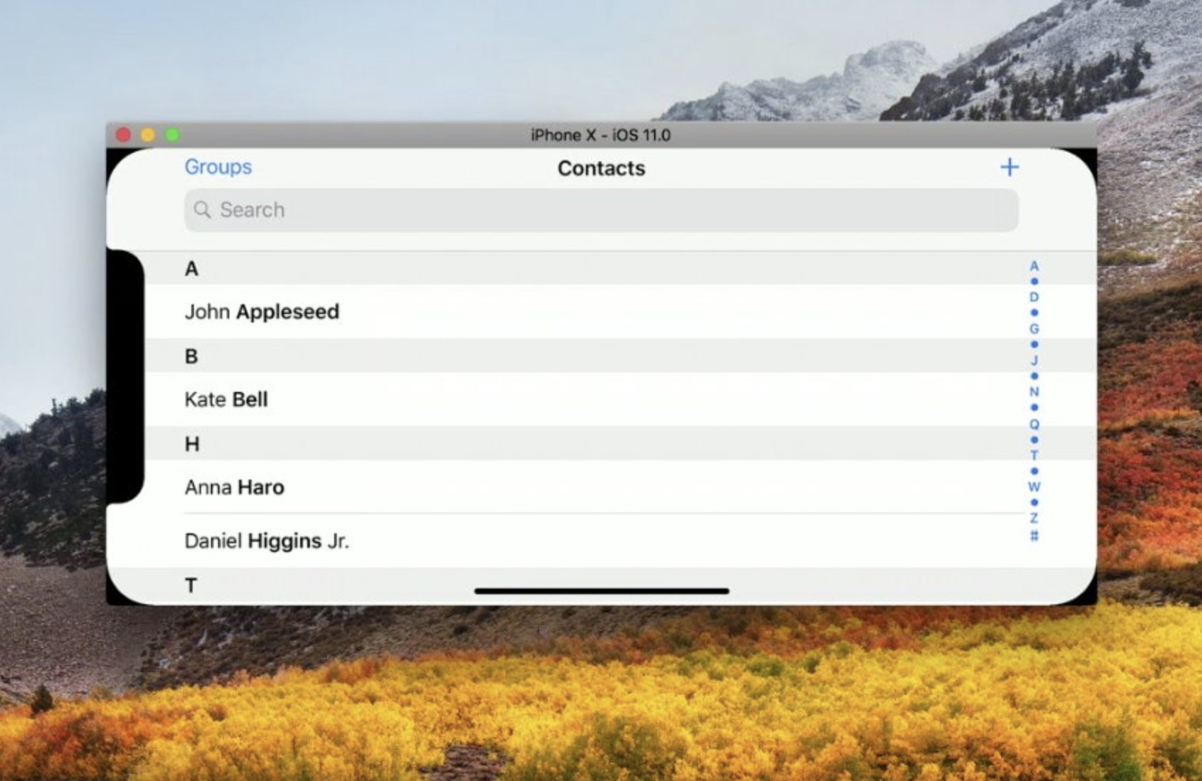
Apple, however, has gone fully in the other direction: it's using a full 'notch' cutout at the top that resembles one giant monobrow. Unlike Samsung, Apple has chosen to embrace the notch and makes no attempt to disguise it despite having OLED's deep blacks available to blend it in seamlessly.
That notch exists for a good reason: it contains a massive array of vision sensors designed to help unlock the device and leverage augmented reality technology (such as Snapchat's face masks) in a whole new way.
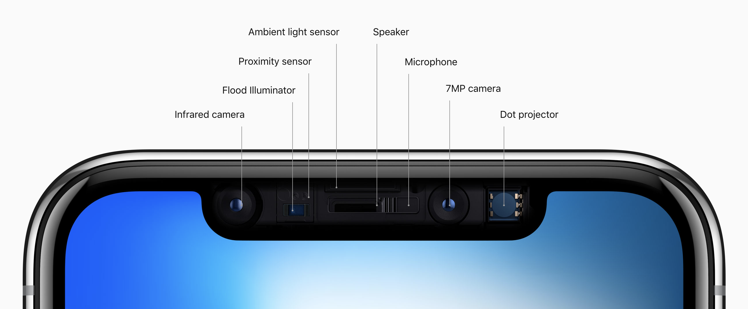
Using an infrared sensor, flood illuminator and a number of other technologies not seen on a mobile device before, Apple is able to create selfies with depth (bokeh, in the photography world) and even allow you to adjust the exposure in real time.
Perhaps the coolest demonstration of what's possible with that technology is in the form of Animoji. The camera analyzes your face in real time, then maps that on top a set of emoji to let you form your own custom reaction. You're able to talk as an emoji and record it -- in real time -- then send that to a friend rather than a video of yourself.
Given how popular Snapchat's face masks have proven to be, this is a smart play that it's easy to imagine will sell a ton of phones alone... if Apple can find a way to break it outside of iMessage.
The problem with cramming in all of this camera technology, however, is that Apple's obsession with getting that screen edge as low as possible has meant it's exposed its failure to embed the array behind the display. The notch, it seems, is now a major part of iOS and the iPhone of the future — but it sticks out like a sore thumb.
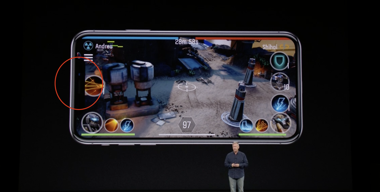
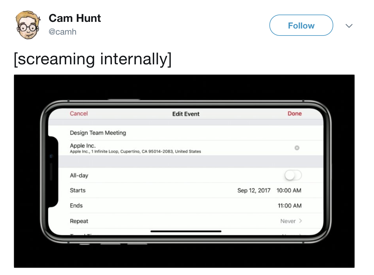
Instead of choosing to leverage the deep OLED blacks that make the screen disappear and hiding the status bar in the 'ears' of the notch, Apple has gone for full color and hard white all the time. It's explicitly obvious when consuming rich content: movies, games and photos look awful with a small bite taken out of the side.
This is the type of laziness I'd have expected from a company like Samsung or HTC, but not from Apple. It was clear repeatedly in the marketing demos during the event that the notch will hide, obstruct or just plain crap all over great content on that screen when it could've been handled better.
The limitations and results of stretching the screen (and removing the home button to do so) become especially obvious when you browse the new gesture library. To interact with a buttonless iPhone, Apple has invented new ways to get around (unlike Android which uses hidable virtual buttons).
Instead of tapping the home button to go home, you now swipe up from the bottom which triggers a lovely fluid animation back to the home screen. If you want to change a quick setting, however, control center is now fudged up in the top right corner of the device and likely needs a second finger to instantiate it.
What's bizarre is that even Samsung has handled these limitations better than Apple. The S8 adapts its interface to the type of app you're using and makes it appear like parts of the phone are "solid" so controls are intuitive to find.
In the camera and photos app, for example, the S8 de-emphasizes the bits of bezel it couldn't fix to find some sort of balance and does the same for movies and other content.
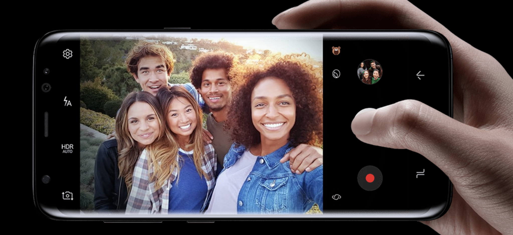
Apple has truly flown in the other direction here, even giving developers advice that they should embrace the notch rather than hide it and instructing them not to attempt to do so. We'll see how it pans out, but it seems short-sighted.
Thinking on this, I've come to the conclusion that the only explanation here is simple: Apple plans to use the notch as a marketing symbol for the iPhone X, and the decision was driven by the marketing department rather than product.
Instead of pursuing how the Apple of a decade ago would've implemented this technology and blended the notch into the background, the company has chosen to trumpet it front and center.
This choice gets disappointing the more you look into it, mostly because Apple's choice of bright white interfaces throughout iOS pronounces the notch constantly, no matter what you're doing. Writing an email or watching a movie? Enjoy the missing slice out of your screen.
The salt in the wound is removing Touch ID in favor of Face ID, which is only a result of needing to stretch the screen to the limit and a failure to integrate it into the display. Apple reportedly tried to do so for months before conceding it isn't possible yet.
Face ID is impressive tech — it works with makeup, beards, different outfits, facial changes and more because it uses machine learning under the hood to figure out if it's really you alongside that fancy vision array tucked into the monobrow.
Apple claims that Face ID is faster and more secure — I'm sure that's partially true — but scanning your face constantly, training an algorithm on that... and normalizing it as a security technique makes me uneasy at best.
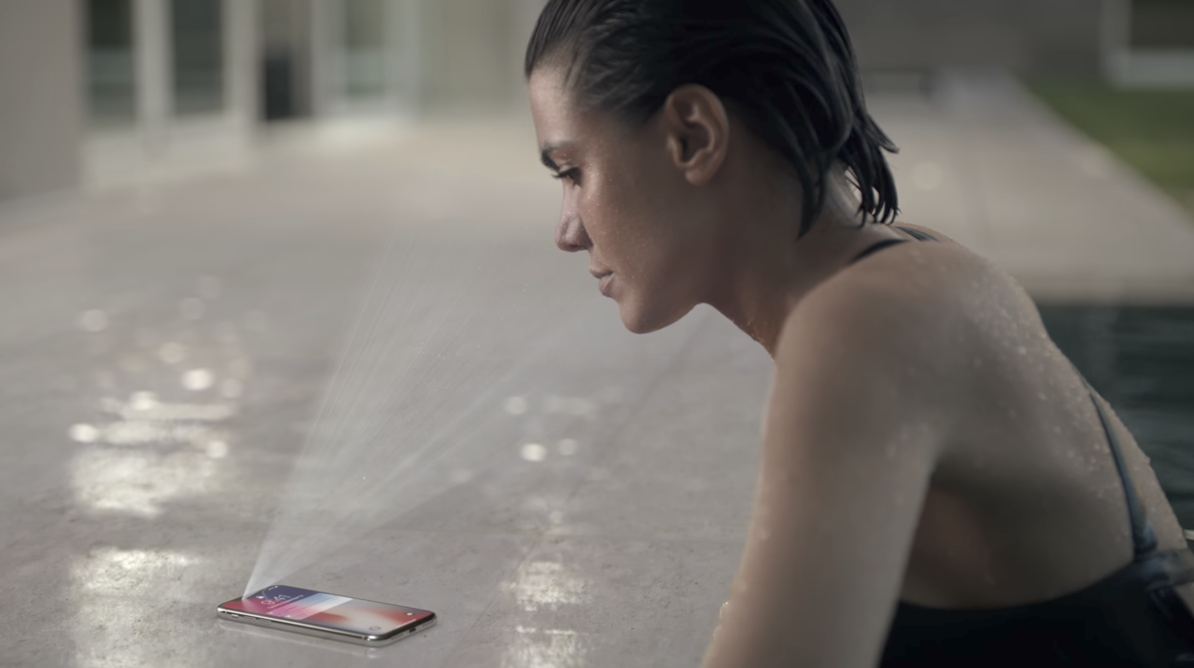
At least with Touch ID I have ten fingers to secure my device with, but with Face ID I have a single face to lose and that's it — and Apple spent three years drumming Touch ID as 'the best' security for a mobile device into our heads... but now expects us to eat up that it's already dead (while still hocking it on the iPhone '8').
All of these things combined are a bummer. Apple's produced a beautiful result, with boundary pushing technology but seems to have layered on compromises in order to get this out the door.
It's still only been a few hours and I'm digesting what we saw, but my gut reaction to the event is one of confusion more than anything else. This is a phone that screams potential but is let down by a lack of attention to detail, and more importantly, patience.
Apple's doubling down on vision technology is where it's clearly now leading the way, and marrying it with machine learning in iOS is paying dividends in meaningful ways — these improvements to the cameras and the focus on Augmented Reality is what absolutely blew me away. My jaw was on the ground when the company was cycling through the details of the camera array.
While everyone else in the phone world is busy making specs-focused cameras in their devices Apple has consistently delivered camera improvements that blow me away in the real world, and I suspect is why I'll end up breaking and buying this phone. If Snapchat Inc is a camera company, it makes a point-and-shoot camera and Apple is Canon, re-inventing the entire category.
This said, the rough edges are beginning to show and it's clear the company is no longer focusing on the detail that made it great.
If the iPhone X is really Apple's vision of the future it's of a rushed one, with failed attempts to push technology integration and the pared back results of that are going to distract from the marrying of incredible technologies.
This phone is not what I imagine it would've shipped if it wasn't facing the pressure of a ten year anniversary edition. It certainly doesn't push the boundaries as far as one would expect from a device explicitly labeled as a "future" phone from a company with $250 billion in the bank.
I have no doubt in my mind the X will serve as a success for Apple and that it will sell like hotcakes, but it's a shame this is the result:
