At Google's annual developer conference in Mountain View today, the company took the wraps off the next version of Android. It's not named yet, so simply called 'P' but what is clear is that Google is executing on its clear lead in AI across every surface it develops for.
Here's my biggest takeaways from today, and what I think is key moving forward.
Machines with context

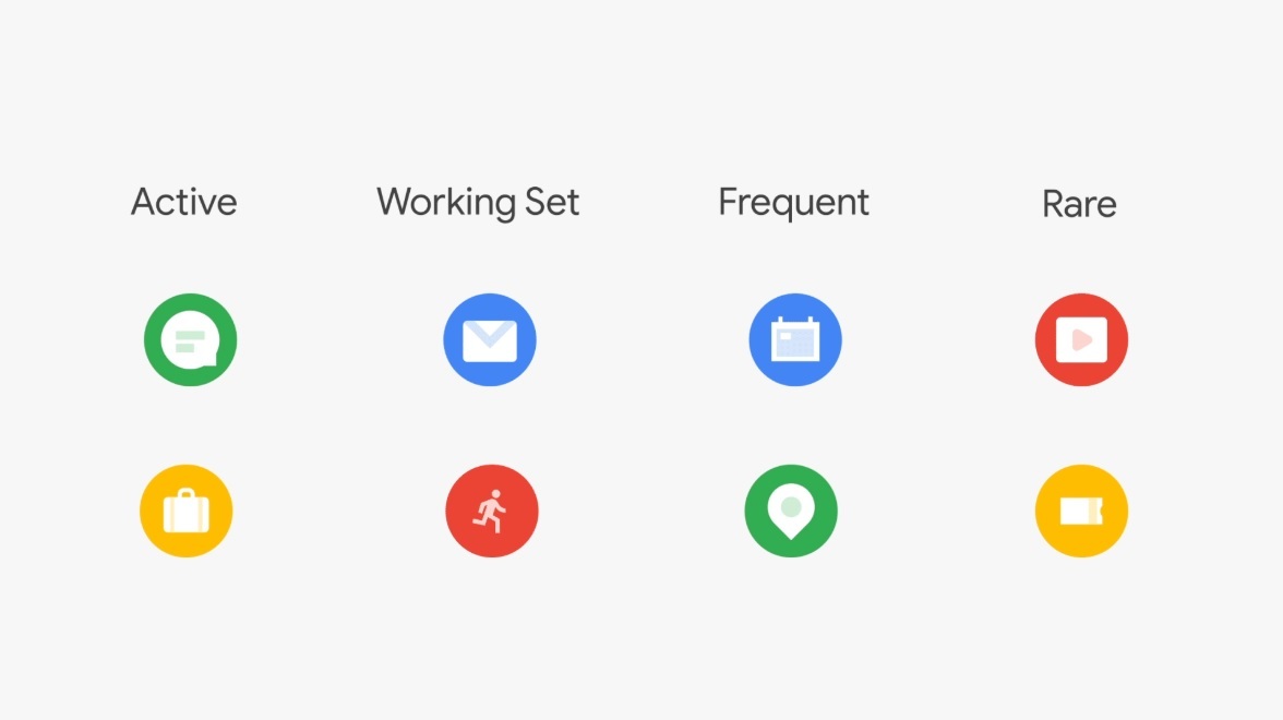
Google's been investing in artificial intelligence for years at this point, and that lead is beginning to pay off. Android P, at its core, represents the merging of software with these smarter tools, using it to help the end user proactively, rather than simply applying the same set of rules to everyone.
A great example of this: adaptive battery. Google now processes signals from across your daily usage, including the types of load you put on it during the day (for workouts, for example) and adjusts the phone's performance accordingly to squeeze out as much as possible.
Apple has built similar features for optimizing battery, but where you start seeing the rift is how this is implemented. Google uses signals from throughout the day, over time and the different types of usage you use, then creates a long-term understanding of your usage patterns.
In many cases, Apple has had some sort of similar functionality that ends up being just bludgeoned into place. App suggestions, for example, were delivered years ago on iOS, but the ability to surface information from apps as you're searching is far more useful: the right information at the right time.
The same smarts are applied to adaptive brightness, which now monitors how you adjust your screen's brightness throughout the day to understand better how you adjust it for different conditions. Essentially, your phone is beginning to understand you on a personal level, and that's a monumental shift for mobile: devices now have context.
This goes even further with Google Assistant, which is able to do things like call and make bookings on your behalf, suggest tasks when you're switching apps, or even offer up information it anticipates you need, like the price of a Lyft.
Time well spent

A new area for any software maker, Google is focusing heavily on 'time well spent.' This is the movement we've seen in recent times to be more aware of the time we spend using our phones, and is a push to be more present in the real world.
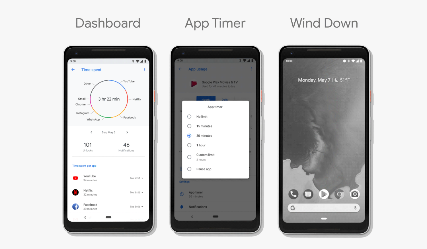
New tools including Android P's 'dashboard' are designed to help people understand what they spend their time doing on phones and how often they're unlocking it. Essentially, Google's bet is that reducing phone usage is actually good for everyone, rather than trying to get people more addicted.
The Time Well Spent movement spells the issue out well:
Facebook, Twitter, Instagram, and Google have produced amazing products that have benefited the world enormously. But these companies are also caught in a zero-sum race for our finite attention, which they need to make money. Constantly forced to outperform their competitors, they must use increasingly persuasive techniques to keep us glued. They point AI-driven news feeds, content, and notifications at our minds, continually learning how to hook us more deeply—from our own behavior.
Google's business model is predicated on our attention, which conflicts with its message today, but it's able to understand what the implication of an escalating addiction problem could be: the decimation of the attention economy.
The features Google has implemented are many of the direct recommendations from the Time Well Spent movement. Android, for example, can now be set to fade to greyscale at night, which disables the reward centers in our brains triggered by colors.
Google is the first company to move here when most of us expected it to be the last; I certainly did.
For the company to be self-aware enough to realize that these attention extraction practices are not sustainable, and that such tools being available will help people make changes in their own life — for better or worse on Google’s bottom line — is impressive.
Design

Material Design is back with a vengeance.
When Google first launched the design framework in 2014, it was a loose set of rules that ended up being widely adopted by the Android community. The problem, however, was that the system both wasn't flexible enough and didn't go far enough, leaving the developer to figure out a solution.
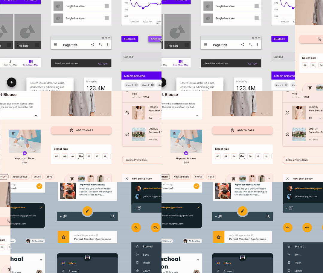
Google's finally stepped back, learned from these mistakes, and built a system that goes beyond what we've seen from the major platform builders until today. Now called Material Theming, the system covers design for web, Android and iOS, covering everything from typography to motion design.
What's clear here is that Google has built out a thoughtful design system that is designed to get out of the way and help developers build unique apps -- even if they're not designers. On top of that, it's making it easier to put it into practice.
The new Material framework is both a set of components for designers to work with and a set of developer APIs that make it easier to implement those components. There are tools directly from Google, like an official Sketch plugin and even a tool called Gallery to make hand-off to developers easier.

From the few previews Google has given so far, it's clear that Material is poised to be the defining design language for the next few years. Apple's flat interfaces are clearly outdated when directly compared with Google's new focus on breathable space, color and motion.
Stay tuned for more on this, but there's a bunch you can play with on the Material site today. I expect we'll hear more over the next few days. What we didn't hear about, was any sort of requirements for apps to implement the framework, which would help raise the bar across the Play Store dramatically.
Your move, Apple
For the last few years, many of us wondered if operating systems would see fewer major updates. Both iOS and Android received minor feature releases over the last two years that didn't add much meat, but Google proved today there's still plenty of ground left.
Google's artificial intelligence investments are paying off dramatically, and it's using those chops to rapidly outrun its competitors. Context, in the future, is everything, and it's clear that Apple isn't able to keep pace.
Google is playing catch-up in some areas, like the gesture-based navigation and fluid app switching it demoed today that clearly resembles what was introduced for the iPhone X in 2017. But, armed with a killer design framework, it's making a statement about how fast it plans to move.
What's not clear just yet is where privacy is in all of this.
It's great that Google is willing to help us use our phones less, but I'd like to hear more about how these machine learning smarts actually work. The company hinted today that it performs much of the magic locally, without hitting the cloud, but didn't detail which things are covered.
Today, Googled showed off the future, in a much more coherent way than Apple, Samsung or any other device vendor has in years. In a single keynote, Google showed us how our phones will get better, a design system that changes the game, and tools to make us more thoughtful.
Switching to Pixel 2 is getting better every day!
