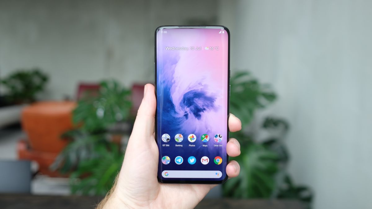
It's been about six months since I switched to the Pixel 2 XL, Google's flagship phone for 2017, which I described as 'absurdly close to being perfect.'

Back then I wrote about how Google's ecosystem is clearly stronger than Apple's, and how I was tempted into this journey unexpectedly by Google Home. I'm still using Home, and the Pixel has dragged me deeper into the ecosystem than first anticipated. Still, I've learnt far more than I knew when first switching, so it's time to review where Google's Pixel efforts shine, and where they fall short.

It's easy to make a first impression after a month, but what about when it becomes just normal? Read on for my experience so far, and feel free to ask questions in the comments if I've missed anything specific.

Killer camera or camera killer?

I'm still blown away by the Pixel 2 camera every time I use it. It's magic to have such a powerful camera in your pocket, and it's decimated my usage of the Fujifilm X-T1 I used to carry around everywhere.

The Pixel 2 camera really has reignited my interest in photography, mostly because it's so ridiculously compact and camera access is so easy — just double tap the power button and snap the shot. Its sheer speed has meant I've been able to capture fleeting moments that would've passed on my iPhone, and it's a huge plus on a day-to-day basis.

I've seen hundreds of photos out of friends' iPhone X and iPhone 8 this year, and done many comparisons in person and frankly, the competition just doesn't play in the same ball game. If I ended up with the iPhone X's camera while the Pixel 2 could shoot photos like it does, I'd be bummed.

Google nailed the camera in this phone and if it's able to continue this lead it really may be able to pull thousands of new customers away on this point alone.

I've had regular conversations with people impressed by the photos I've taken and have assumed it's a DSLR, so ask which one I'm shooting on and are shocked it's actually created using a phone.

A big part of what makes the Pixel 2 XL camera so good is its sheer speed. I can get to the camera app before it's even out of my pocket — by slamming the power button twice — and this alone has meant I've used it for more 'in the moment' shots than I ever did on the iPhone.

I don't know what to tell you on this one, because I feel like I'm just banging on a drum that's already been said over and over. The camera keeps blowing me away, and everything else doesn't even matter as a result. I've stopped using my DSLR, because the Pixel 2 is a photography killer.

The only thing that's really missing is the killer photography editing apps. I loved Halide/Darkroom on the iPhone and there's such a massive opportunity for an app in the same vein on Android. These types of developers seem to think their app should exist on a single platform, but I think they're missing out on a golden opportunity to make serious money.

I'm hoping that will change soon, but for now the photos are so good that I mostly don't think of editing them anyway.

Android

Android's little flourishes and flexibility are what makes it so compelling, and many of these features can only be discovered through usage.

I discovered on a trip to Switzerland that my mobile roaming data package didn't include coverage for the country, so I'd have to buy an expensive, restrictive data pack.

Dreading this, I did so, and Android suggested I enable 'Data Saver' to ensure I don't go over the limit.

Data Saver is an OS-wide control that restricts the usage of your mobile data to active usage only, banning background checks, and can block certain apps from functioning — it's a lifesaver if you're travelling.

Paired with the free Datally app, it made for a much less stressful trip. I only had 1 GB, but because Datally could pop over the currently active task and show me what I used in the session, I was able to better gauge what was happening underneath. I didn't blow my data cap.

Another great example here is the ability to kill or tweak any notification's setting directly inside the notification itself, blocking that type of notification or the app entirely. On iOS, this would be a trip into the hellish Settings app, only to give up and keep receiving it forever.

Switching to Android just makes picking up my old iPhone 7 feel archaic for a bunch of reasons, most of which come back to the way iOS' interaction model is structured around tabs, endless hamburgers and menus inside menus. Apple's OS focuses on form so intently that it often forgets the function, and stumbles over itself trying to get things done or blocks the user from doing something in its walled garden, while Google has found a good balance of aesthetic and getting shit done.

While I could list out all the things I love about Android forever, a few highlights that have changed my workflow:

  • Pulling down notification tray/quick settings by swiping on the fingerprint sensor
  • Snoozing notifications for later
  • Wallpaper can change automatically every day to a beautiful new shot
  • Automated call screening that figures out who's calling even if they're not in my contacts book (including businesses and spam callers)
  • Picture-in-picture with Netflix, YouTube and so on for tweeting and streaming at the same time
  • Progressive Web Apps and Instant Apps support — I access my community via a PWA that features instant loading, notifications and a native app icon with alert bubbles.
  • I've never ever seen a storage full notification, because it's self-managed

Separately, I was worried about performance over time on Android but it's been a non-issue. The device is as buttery smooth as when I got it, and doesn't really miss a beat ever. Scrolling performance is great and everything's snappy; just like I'd expect from an iPhone.

All I'd like to see, as I'll touch on later again, is more coherency. Google's really made Android into something that works well and has thoughtful design all over the place, but it just needs to push further into the identity it created for Pixel.

The Pixel Launcher, for example, which serves as the homescreen for these devices, is great. I love the calendar widget for my next appointment and native weather integration, rather than just a sea of icons, but I think there's so many more opportunities to improve here.

It's great that the home-screen is so much more than what I can get on iOS, but Google could do with being more instructive here. Give me the ability to embed my inbox, or pull in other data about my life without launching apps. I've had a taste, but now I want more choice.

There are a bunch of rough edges that clearly show this. The example that comes to mind is the experience of uploading photos to something like Twitter, which is a complete mess. You're thrown into a files app that has no relevance to the task at hand, and seems sorted at random.

The photo upload experience..

To get to your photos in the files app there's an option buried in the sidebar — but god forbid you choose the 'Images' option also shown there, which throws you into another screen full of folders. It's fine but just plain stupid.

There are places across Android that need fixing like this, like that you can't access photo albums at all without downloading the image manually, or that the clock app inexplicably looks like something out of Android 4.0.

Google is close to getting this right, but needs to really sweat the details of these little UX interactions. Apple's uploading process leaves something to be desired too, but at least it isn't confusing.

Ecosystem, apps and more

I've touched on the lure that was Google's ecosystem in the past, but I've been impressed on this point particularly as I've used the phone more.

After a few months of using Google Photos, I was convinced enough that I made the decision to upload my entire RAW library of photos from the DSLR into it — about a 15 year's worth of shots, stored on a NAS.

Alongside Google's handy new backup and sync tool, which makes it easy to continuously sync photos, I now have access to every photo I've ever taken from a single app. Searching for beach can pull up a photo from 2003 I forgot about, or the last trip to the ocean before I moved overseas.

The great part of this experience is it didn't feel like it was yet another thing to pay for extra storage because bumping Google's cloud storage up does it across products.

Now, I've got a few terabytes of storage which is shared across Drive, Photos, Gmail and whatever else there is, where before, I paid for iCloud just to make photos and backups fit.

As a result, I've now dropped Dropbox to use Drive exclusively — another paid subscription I could get rid of, since Drive has a similar feature set and fantastic file sync that doesn't take up disk space on my computer.

The wider ecosystem has been rewarding too. Integration with Google Home means I can ask Assistant on my phone to turn off the bedroom lights — or just do it via a speaker instead. If I'm listening on Spotify on my way home, when I walk in the door I can just fling the music there — it's great.

Google launched Routines a few weeks ago, which takes this to the next level. Now if you say "goodnight" or "I'm home" it'll adjust the home and your phone to your liking, throwing it on do not disturb and dimming the lights.

I've also been impressed with the quality-level of Android apps at this point. I have not found myself lusting after some new iPhone app the entire time I've been using this phone.

Sonos, for example, allows native lock screen controls alongside the ability to adjust with my volume rocker whenever I'm at home. Pocket Casts is a superb podcast app that helped me expand my listening habits. Weather Timeline is a gorgeous app for seeing the forecast.

The biggest thing I'd note is that while the ecosystem is there, and Material Design has had a real impact on third party apps, Google needs to double down on this. Material Design is a great system that stops too far short, and Google doesn't enforce its usage at all.

While the majority do actually use the design system in some way now, the way material seems to be implemented is clearly at random, with no enforcement — leading to some quirky, unpredictable results based on your assumptions of what a swipe might do.

I'd love to see Google get involved with the quality level of apps out there in a future iteration, and somehow require developers to actually use these systems, let alone properly.

It doesn't seem that difficult to draw a harder line on the Play Store here, and I think it would go a long way to improving the overall ecosystem's health.

Health

One qualm I had giving up the iPhone was my love for the Apple Watch. I spent a few months not wearing anything and being OK with it — which says something in itself, I guess — but eventually found myself wearing a Nokia Steel HR.

It took me a long time, mostly because I was saddened by the state of Android Wear (er, wearOS), that appears to be in some sort of suspended animation with few compelling, simple pieces of hardware I'd actually wear.

The Nokia Steel HR was a conscious choice for a few reasons: it plays well with Android with native calendar/SMS/call integration, and has a killer battery life of over 30 days while still maintaining the heartrate sensor I loved from the Apple Watch.

Reviewing the Steel HR itself is out of scope here, but it's awesome while not breaking the budget and freeing me from the curse of charging a stupid watch every night.

I'm bummed that while Nokia has done a great job with its Health Mate app, it doesn't integrate with Google Fit as deeply as I'd like. Maybe that will change if Google acquires them, like is rumored, but I'm not all that hopeful.

Google Fit is, like many Google projects, a fantastic start on a HealthKit competitor — but it needs building out. The basis is there, and it's compelling enough to use on a regular basis for things like goals, but it can't do all that much today. I'm hopeful that I/O will address this.

Hardware

The section you were probably waiting for all along: how is the hardware doing after six months of full-time use? I wondered about the longevity of the device going in, because Google's hardware bets are still at an early phase and it's hard to know how it'll hold up to the test of time.

One of the biggest concerns out there surrounded the OLED display on the Pixel 2 XL, and I remain of the opinion that it might be the biggest non-issue of all time. Color reproduction is fabulous, and the screen's contrast ratio is just lovely when compared with an LCD screen, even six months in. Not even a problem, and haven't thought of it once.

The screen remains relatively scratch-free, which is an impressive feat, and the body itself looks good. There is a caveat: some of the painted edge did chip away after a few months of usage, leaving a tiny, but nasty looking gash at the bottom of the phone. It's probably my fault, because I bike with the phone in my pocket and it's enormous so it rubbed against the pocket's eyelets, but it is a bummer nonetheless.

Since that incident, I've been using a Google Fabric case on the phone. I'm not a case person at all but this one won me over; it's like putting it in a cozy sock! It's so comfortable to hold and adds an extra layer of grip, so I just don't care that it adds heft for once. I love how different it is, and it's just such a great idea for a case (yes, it gets dirty sometimes, but a cloth wipes everything off).

I've also managed to not smash the back glass, which I was worried about. I used the phone without a case for a good four months and I half-expected it to be broken by then, but all good. Others I know, however, have broken the back glass already and it's not cheap to fix.

The front-facing speakers on the face of the screen are so fricking good that it's unbelievable I didn't mention them in my original review. These have changed the way I watch videos, and now I'm actually willing to watch YouTube or Netflix on my phone while on the couch, which I'd never done before.

Having the sound project straight out toward you is awesome, and it's surprising how great these speakers really are. I won't be blasting music in public anytime soon, but these actually changed how I interact with my device on a regular basis.

Finally, a surprise delight on the hardware side has been how great USB-C is to use. I went into this dreading it, and have come out better off!

Unlike in a previous lightning-laden life, I use just a single cable now: the charger from a 15-inch MacBook Pro, despite not actually owning one. With that cable I can charge my Dell XPS, the Pixel 2, a Nintendo Switch and my battery pack -- no more dongle bags!

OK Google, you did great

I fully went into this experiment assuming there would be some shitty gotcha that would make me want to go back to the iPhone, so I kept it around just in case almost the entire time. That hasn't happened because Google did such an outstanding job with the Pixel 2 XL, so I've sold finally sold the iPhone.

After six months of owning the Pixel 2 XL, I have zero regrets. This is the first Android phone I can confidently say has been a delight to experience, end to end. Google nailed the camera, which sucked me in, but the ecosystem kept me here and it's been a game-changer for my workflow.

It's a weird feeling to say that Google is leading the way in ecosystem in 2018, but I believe it truly is! While Apple is struggling to ship fundamental features it promised all the way back in 2017, Google took the Pixel from having potential to being an iPhone killer by just keeping at it.

If it continues the trend with the Pixel 3, and into the future, I can't see why people won't consider jumping ship. Google's newfound design chops and focus on building out an ecosystem that people love is clearly a core part of where Android is headed.

It's clear from my last six months with the Pixel 2 that Android P, the next big update for Android to be announced at I/O in May, may be a game-changer that seals the deal for many. If Google is able to show off coherency, attention to detail and further ratchet in on its ecosystem, I believe people will begin to test the water in droves for the first time.

The Pixel 2 changed the way I think about phones, mostly by getting out of the way. Google should be commended for having gone from flirting with making a phone to nailing it within a few years, which makes me even more excited for future iterations of Pixel.

Given that the company has doubled down even further since the launch of Pixel 2 with thousands of hires in the hardware division, I'd say there's much, much more to come. Google hit it out of the park, and it's found a long-time fan for the Pixel 2 in this former iPhone fan. It's Apple's turn to play catch-up.


By Owen Williams

Owen is an technology journalist with a background in software development and helping people understand the industry.

Based in Toronto, Canada, Owen writes a weekly column for Medium's OneZero, and spends his days as Content Strategy Manager at Shopify.

More about Owen →