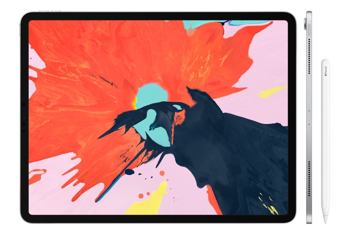
The new iPad Pro is hard to ignore. It’s one of the most inspiring pieces of hardware design in a few years, with next-generation silicon designed in-house and performance to match. It looks like a computer from the future in every way, so I decided to order one on launch day and see if I could make it a part of my workflow.
It’s probably the most confusing hardware I’ve ever written about, because I’m so torn on it. The iPad Pro is impressive across the board as a device to use and carry every day, but is simultaneously disappointing in so many ways that it’s frustrating to use.
Over the last week and a half, I’ve spent the majority of my work days using the iPad Pro as my dedicated computer, writing some 50,000 words on it in that time.
The majority of my days are spent writing posts, newsletters, marketing content and emails to clients, so it seemed like a decent fit for me. I write code sometimes and run my own subscription service, but I didn’t go in with the expectation to replace that part of my workflow with the iPad.
I started this experiment open to new ways of working, rather than trying to shoehorn in my desktop workflow, because I know that it’s just going to be painful to do so. This post is some initial thoughts about the experience, rather than a full review, which I’ll publish later.
Delightful flourishes
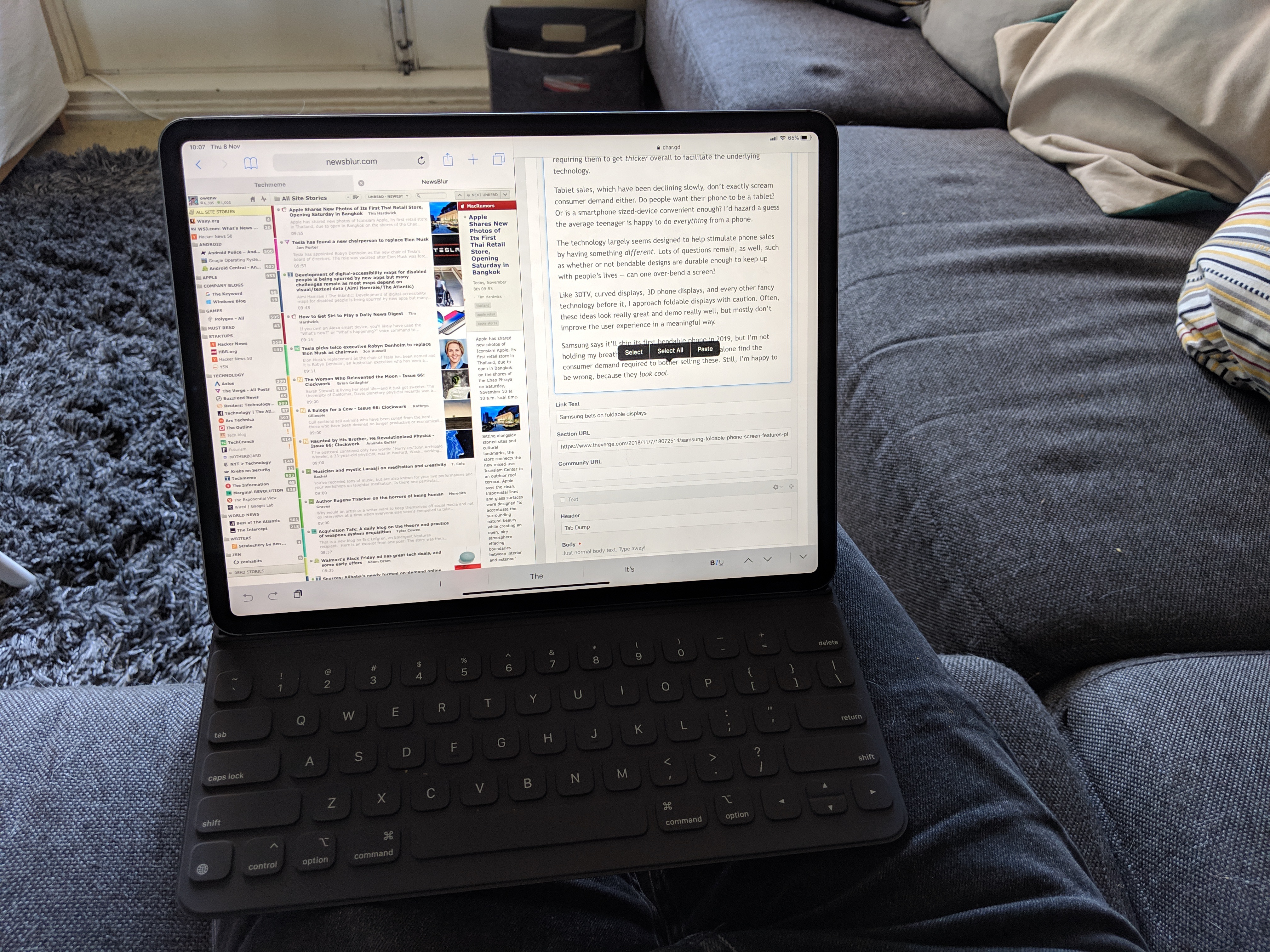
Here’s the thing: the iPad Pro actually works fairly well for the way I work. It’s a fantastic writing machine, and I didn’t mind tapping away on the official keyboard case for a few hours a day— iOS is simple enough that it felt like it helped me focus on the job at hand.
For the most part, it worked well. I could split apps to get writing and research done, there are plenty of high-quality third-party apps for writing, and it never slowed down or got stuck doing something. That, in itself, is a huge high point of these devices: they're fast, and reliably so, without messing around. I can just sit down and write.
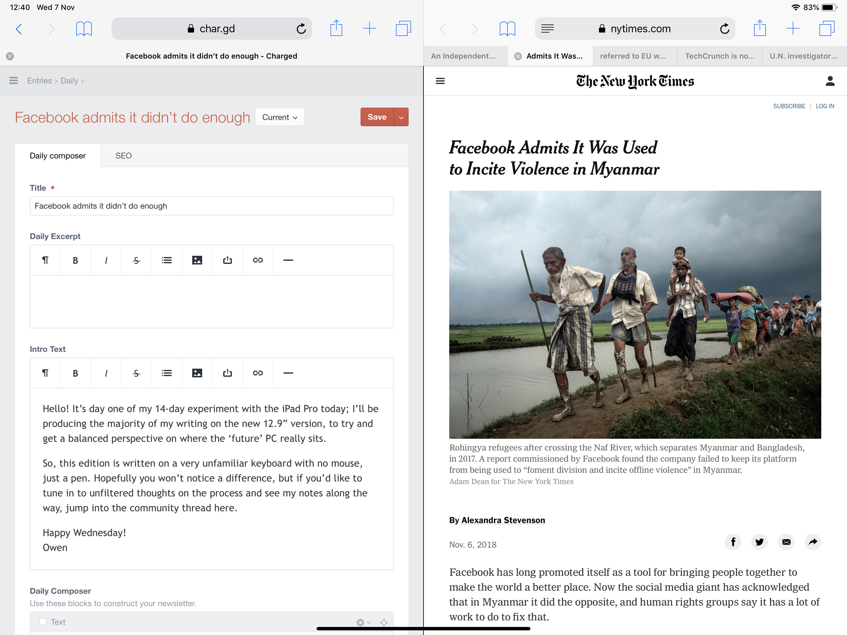
In particular, I love the way iOS allows an app to be ‘glued’ off to the side of the screen. While I’m writing this piece, I’m able to swipe from the right-hand edge to check Twitter quickly, then throw it back off-screen to keep focused. Any compatible app can be attached app here, and I spent most days alternating between Discord, Twitter and Slack, without actually exiting the main task at hand.
A delightful improvement over last generation is Face ID, as well, which I’m accustomed to using across my other machines with Windows Hello on a daily basis, so it felt fairly normal already. It smooths over all those annoying long passwords you have to type, and makes life easier — on this form factor it makes so much more sense because it’s hidden away in the bezel, making it feel like magic.
What really makes the iPad Pro special, however, is that it’s always ready to go when you need it. Taking it out of your bag, opening the case and getting to work takes five seconds at most because it’s always on, which is something that PCs in general have failed to nail over the years.
The cellular edition in particular is magic, because the combination of Face ID, always-on cellular, and a long-lasting battery makes the device melt away so you can get to work. The closest I’ve found to this anywhere else is Microsoft’s tiny Surface Go, but the cellular version isn’t shipping yet.
There’s so much potential here, and lots to like, particularly on the hardware side. After using an iPad Pro, I wish every device had a 100hz screen, because it’s delicious to look at. What I’m not so sure about, however, is where this thing actually fits in.
The not so delightful
The thing is, the writing wasn’t the hard part; it was everything else in-between that makes it less appealing. Not having a mouse was frustrating, but it didn’t get in the way of getting work done as much as I thought (though I’d argue that it wouldn’t hurt to add support anyway).
Here’s the thing: the iPad is great at doing one thing, but as soon as you start needing to do any sort of multi-step workflow, heavy research or even just editing my first cut of a piece, it felt like most of the design decisions Apple made were simply to prove that it isn’t a PC.
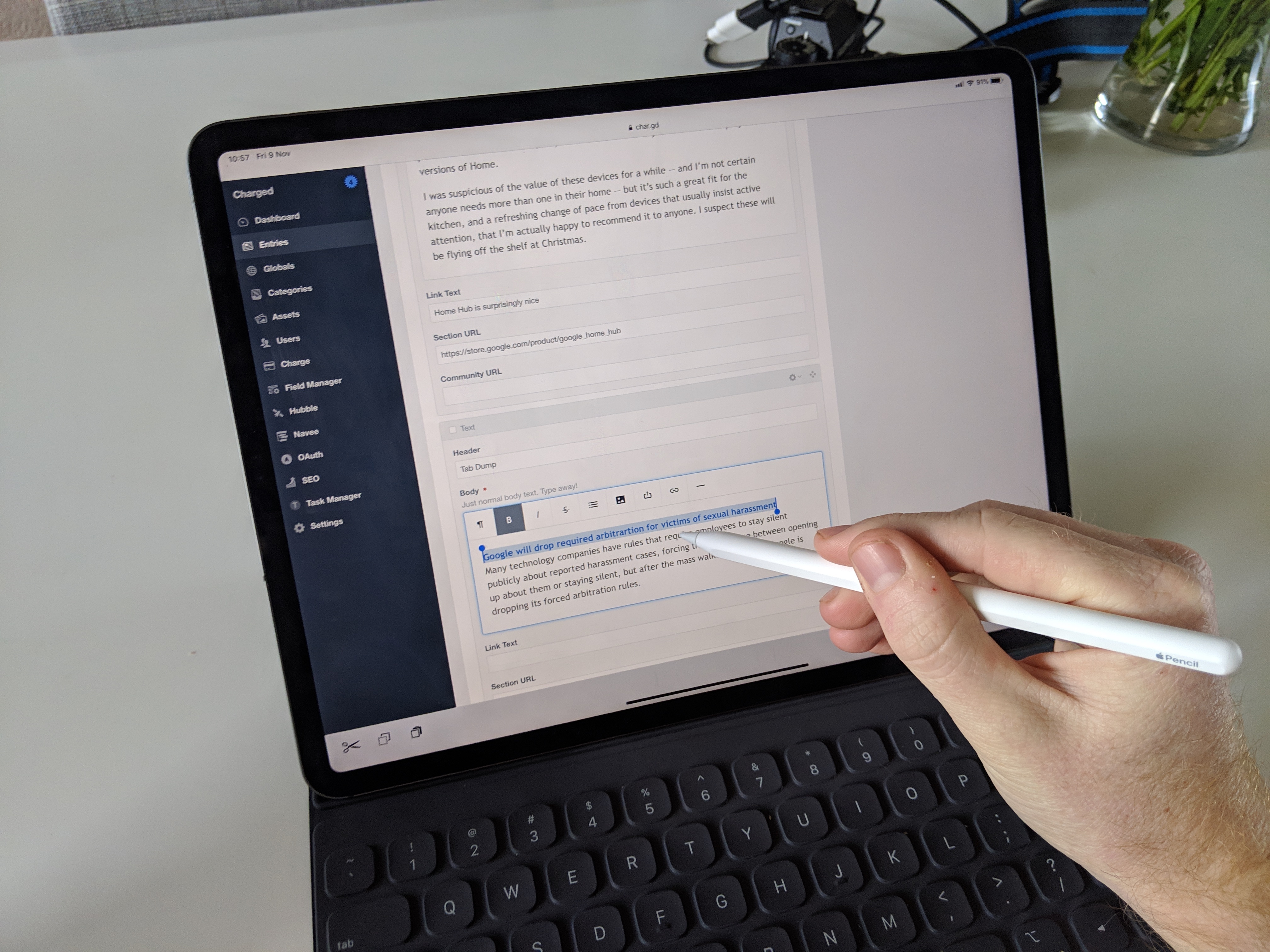
The first real example of this is the Apple Pencil. I love using a digital pencil to interact with my Surface Book 2, and I take lots of handwritten notes using OneNote all the time. The Apple Pencil is a delightful take on the stylus that only Apple could pull off — and I don’t think anyone should buy an iPad without one.
For illustrators, it’s a game-changing drawing tool, but for the rest of us it’s a great way to interact, take notes and scribble —without needing to use touch. Unfortunately, it’s also an infuriating, unpredictable mess if you actually want to use it in any meaningful capacity.
I love using the Pencil to tap around an app, select text or do more precise input, but for no discernible reason, it’s blocked from interacting with any system controls. That means if you’re holding the pencil in your hand and you want to go to the home screen, it won’t work, so you’ll have to change your grip, swipe on the virtual home bar, then switch back.
This is a baffling restriction that’s repeated at random across iOS. If you want to open control center or notification center with the pencil, you can’t. It’s not possible to swipe away a docked app, adjust the size of a split-screen app or switch between apps in multitasking view. This gets in the way on a daily basis and with a virtual home button in play, just makes no real sense.
Then there’s another obvious use for the pencil that’s left out altogether: writing. I’m confused why Apple invented the best stylus in the world, then left out the ability to just write words into input controls or have text transcribed on the fly.
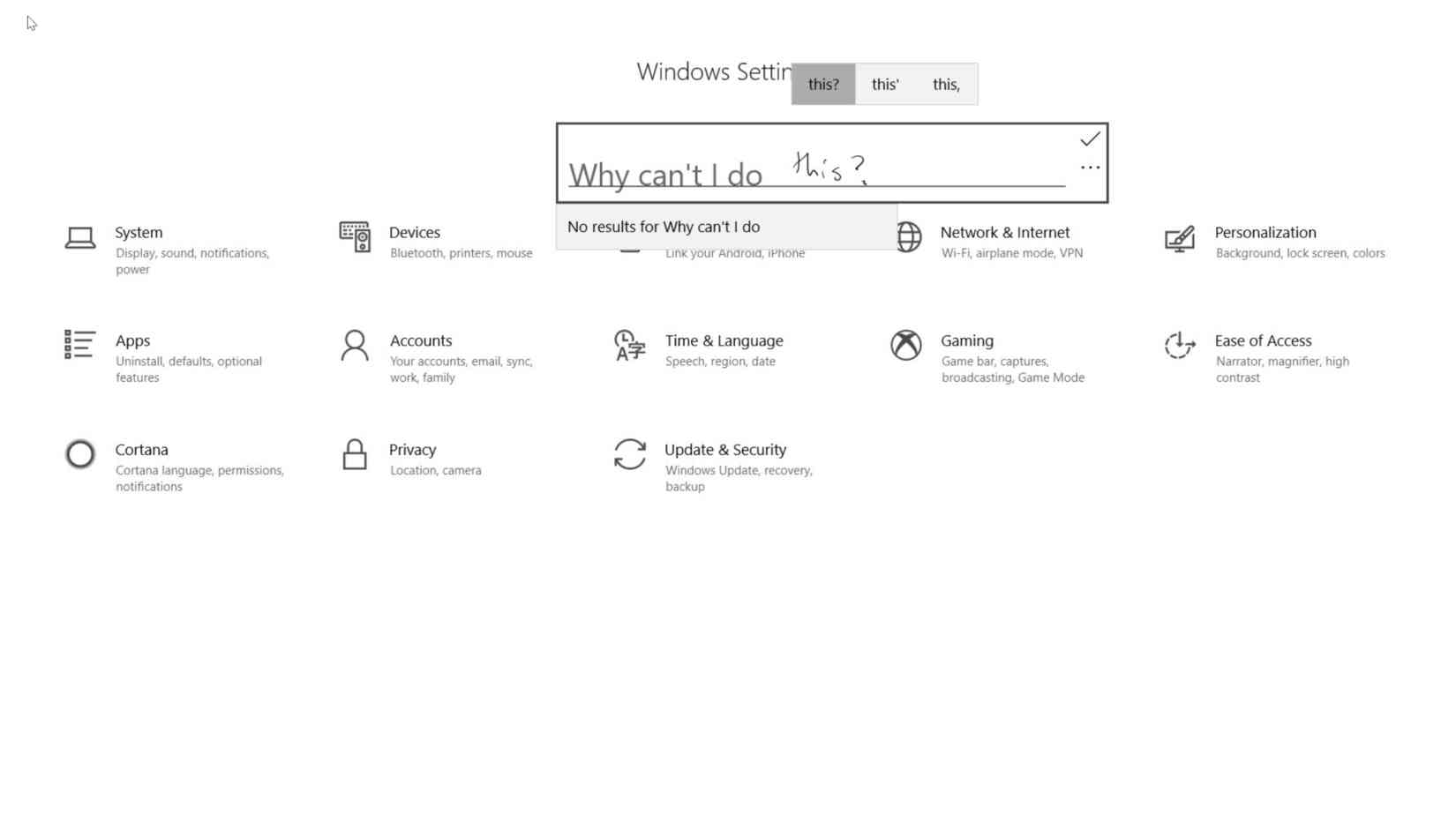
With my Surface Pen, I just write in any text box, but with the Apple Pencil it’s not an option. I kept trying to do this, only to need to switch to the keyboard. Some have argued that it’s slower to hand write than type, and that’s true, but handwriting is so much more natural when you’re already using the input method already that it doesn’t matter.
It’s such a huge miss that I can only attribute it to Apple not having yet figured out how to implement it, but given that the pencil has now existed for some three years, it’s not really excusable given how well Windows handles these use cases naturally.
Another great example of these types of problems is the lack of a browser that can leverage the raw power in the device. On an iPad your choices are Safari, Safari or Safari, and the mobile version of the browser at that — Apple does not allow third-party browser engines on iOS, otherwise you probably wouldn’t use theirs.
Some websites work fine, but the majority of them default to a stretched mobile view — because Safari, by default, tells websites it’s a mobile browser. The amount of times you’ll have to press the share sheet, then ‘request desktop site’ to get a website semi-functional left me wondering why there’s no way to change that behavior, or at least substitute in a browser that can handle it better.
There’s a long list of other random problems with Safari that I discovered at random just trying to get work done. There’s no WebRTC support, for example, which means you can’t use services like Zencaster or Google Meet, which rely on the technology to make video calls. Progressive web apps don’t work properly, because Apple didn’t bother to fully implement service workers yet. You can’t add a website to your home-screen and get push notifications from it, because that would mean you’re less likely to build a native app.
These limitations are littered all over the place, and it’s hard to know what will actually work until it doesn’t. Even the USB-C port, which opens up a range of accessory possibilities is an exercise in spinning the wheel: sometimes it’ll work just great, like with my Yubikey, and other times it won’t, like with a USB stick.
Then there’s getting things between apps. How do I get a photo from my Lightroom library into this document? Copy and paste it? Export it into my gallery? Drag it between apps? It’s anyone’s guess, because the Files app isn’t really worth using still.
These are just a selection of frustrations that I ran into on a regular basis, but it’s the same story everywhere you look, leaving me scratching my head about how to actually make it work in a way that wasn’t just slower than using a computer. The rules and edge-cases make it feel slow, and that’s a problem.
It’s still an iPad
On the iPad, iOS feels like it’s a shoe that doesn’t quite fit properly. Sometime’s it’s comfortable, and almost feels like it makes sense, but the majority of the time it’s awkward or doesn’t work how you’d expect.
I’ve come to the conclusion that in many areas, iOS is just a half-assed hack to make it work on this form factor. Apple loves to push iPad Pro as the future of computing, but if this is the future it’s fairly unimaginative.
A cursory list of things that simply feel thrown together with little regard for how they could be better used:
- Notification Center is a giant- stretched out version of the iPhone version, with no imagination as to how it could work better on a larger screen.
- The home screen is a giant, endless sea of spread out icons. It’s a total waste of space, with little imagination in the way of giving you meaningful insight into your day or what might need actioning.
- There’s a macOS-esque ‘dock’ of apps that can be pulled up with a slow swipe, and this is the only real way to get anything into split-screen quickly.
- The hardware keyboard on iPad doesn’t allow you to just search on the home screen until you invoke the search bar.
- Discovery of features like slide-away apps is impossible unless you accidentally invoke them, or specifically go looking.
- You can split-screen two apps, but no more than that, despite plenty of available space to do so.
- There’s a Files app, but it won’t let you use an external device, or open many file types outside of the officially supported ones.
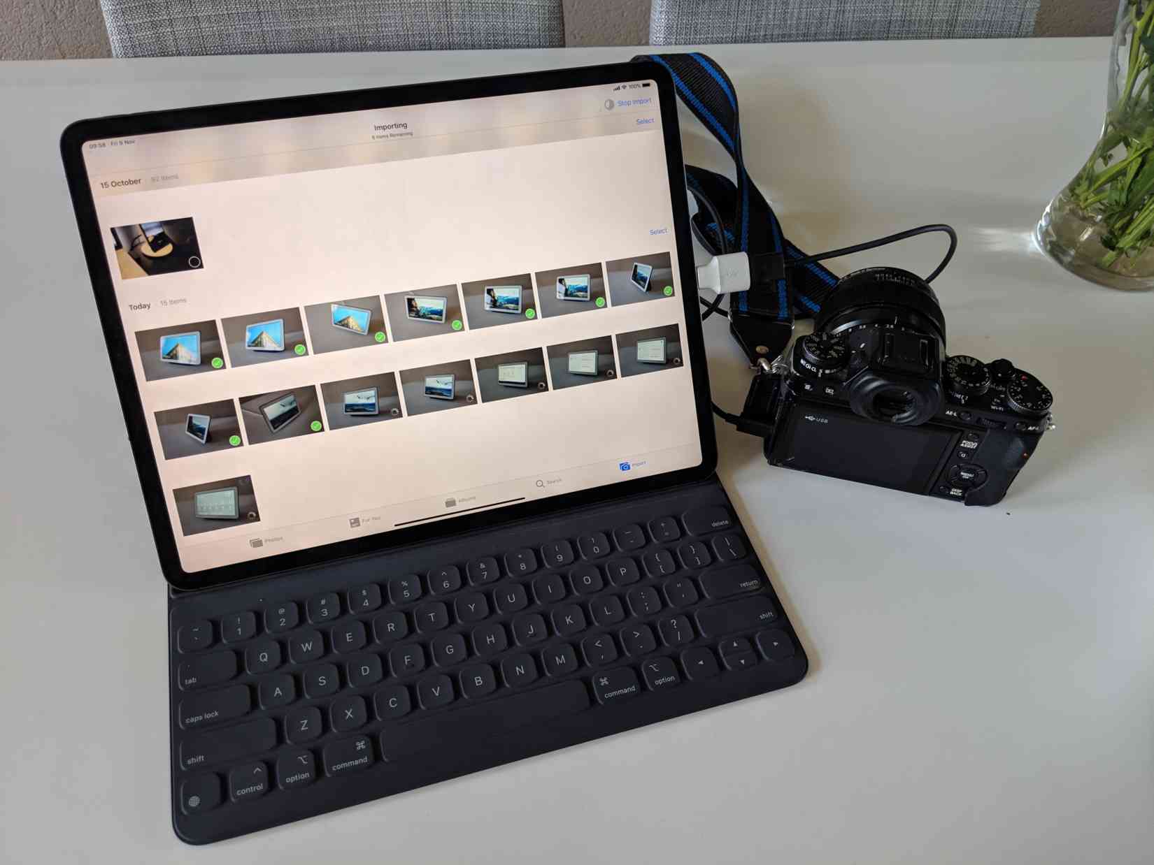
- If you import photos and the storage is a little slow, it looks like it isn’t working at all — there’s no loading state. You just have to leave it sitting there, and not close the app, or it starts all over.
- The share sheet is the only place that system controls seem to end up, so if you want to find something in the text of a page, it’s there for some reason. Additionally, it’s focused on only surfacing apps, rather than people or workflows.
- Seriously, just let me change the default Mail app.
Apple made many improvements to iOS on the iPad in iOS 10, but it’s so unimaginative in the way it re-imagines how we’ll interact with computers that I’m not convinced this is it. I feel like I’m being treated like a baby constantly, rather than letting me utilize the capabilities of the device, walking into walls that seem to be there for no reason in particular.
The problem with the iPad isn’t that it’s not capable enough to become my primary device, it’s that it feels like the training wheels are welded on permanently — a computer from the future, limited by Apple’s mediocre ideas of what the future actually is.
If I could pay $200 and flick a switch to use macOS with the caveat it might suck sometimes, I’d probably do it! The iPad feels more of a fit for macOS, which Apple will never do for obvious reasons, but the hardware almost yearns for it. In a vacuum where the competition doesn’t exist, iPad Pro is an impressive, powerful alternative to old-school PCs. The problem is that Microsoft and Google are getting better, faster at hardware and software, faster than Apple is getting better at software. Because Apple is trying to avoid the dual-mode scenario Microsoft found itself in with Windows 8, it’s making everything painful instead.
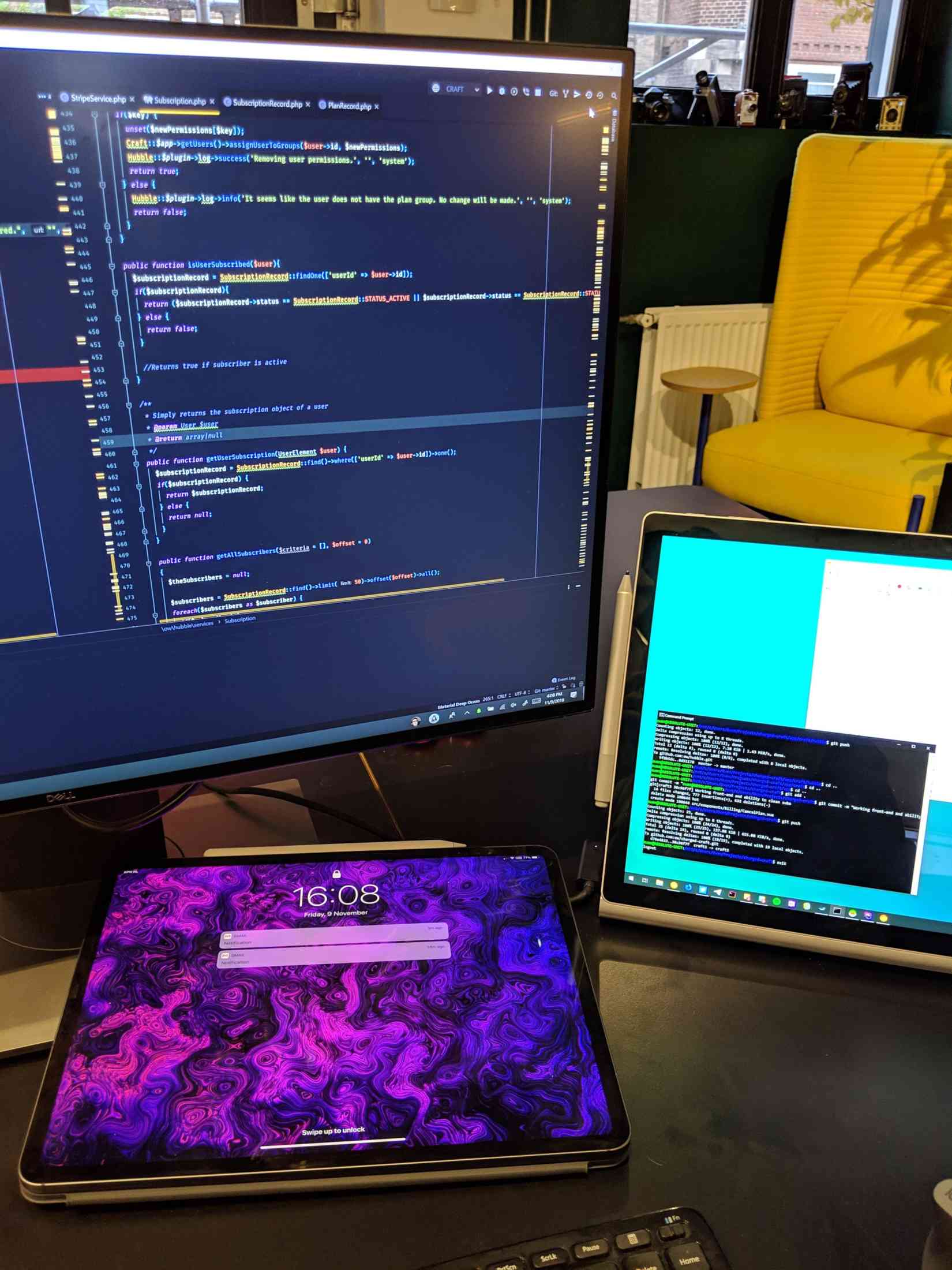
Convertible devices like the Surface Go, or even the Surface Book, are a more coherent look at the future to me. They aren’t perfect either, but in that world I feel like a single machine can get everything done, whereas taking an iPad Pro in my backpack will almost always mean needing to bring a laptop as well. For the price of an iPad Pro, I’m only getting half a computer, and with devices like the Go in the mix, that’s a luxury that doesn’t really make sense to me.
Apple is a clear leader in the hardware space, but the potential of the iPad Pro seems to be lost on the company, which is what makes it so frustrating. It could be an incredible glimpse at a great new way to replace your workflow, but instead, it just trips up time and time again. You buy the iPad Pro hoping it’ll be the next big thing, before realizing it doesn’t completely solve any real void you had.
Apple fans have been quick to yell at me on Twitter about these opinions, telling me that it’ll be better next year. I wouldn’t buy an iPad Pro today on the vague idea that it will get better in the future — Apple’s attention span for iPad has proven to be erratic at best — but I’d re-evaluate again if there was meaningful progress.
Yes, maybe next year it’ll be better, as is always the case. But when will that year actually arrive? Perhaps it's like the year of Linux — always mysteriously a year away from being worth using.
