How to design an emergency warning system
Last weekend, authorities in Hawaii were conducting what they thought was a test of its emergency messaging system, but accidentally ending up sending a message to millions of people that would send chills down your spine:
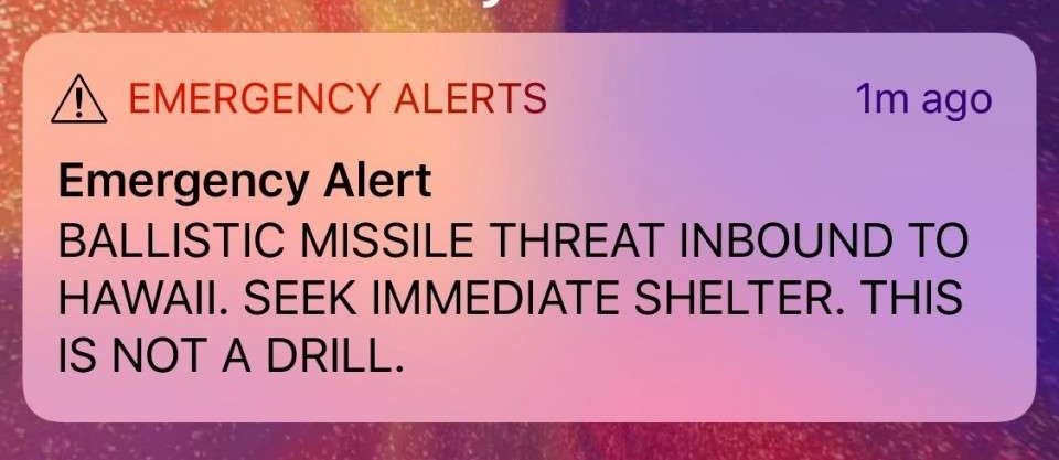
As we all know now, it actually was a drill, but for 38 minutes life in Hawaii was thrown into disarray as people tried to figure out what was going on, where they'd go or if this message was a sort of hoax — until the all-clear came.
While this is not strictly a technology story, it is a fascinating look at the design of everyday applications and how simple errors can lead to mistakes that harm on a large scale. Reports started emerging just a few hours after the alert was sent that the operator of the system had accidentally chosen the wrong drop-down option:
"Around 8:05 a.m., the Hawaii emergency employee initiated the internal test, according to a timeline released by the state. From a drop-down menu on a computer program, he saw two options: “Test missile alert” and “Missile alert."
Almost anyone in technology can tell you of a story where they've clicked the wrong thing inadvertently; the message destined for a girlfriend but sent to dad instead, slamming the 'no' button on a save dialogue, or, dropping the wrong database table and losing production data.
This, however, caused real world consequence and was the result of a poorly designed system — but it can still be traced back to the same origins: humans barely read anything on their screen.
Today, The Verge is reporting on the software responsible for sending the alerts, AlertSense, and how it actually works:
A pop-up box is the final step in sending the alert. The box has the same message, whether a live or test alert is sent: “Are you sure you want to send this Alert?”
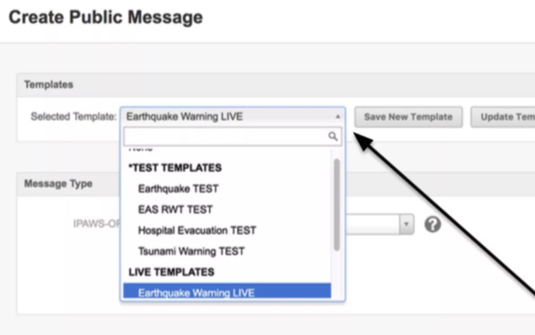
Essentially, an authority is able to custom-craft messages or use templates. These pre-created templates are available in a drop-down menu, and the user is left to their own devices about how to define and organize them.
Creating templates means much faster sending in a time of crisis, but it also leaves a lot of room for error: the people implementing the system opted to append alerts like the missile one with TEST and LIVE, but no other visual cues are given to warn the user that they might be doing something that has consequences.
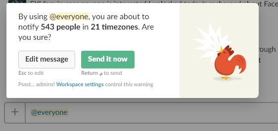
As others pointed out on Twitter, even Slack has a mechanism that'd help in a scenario like this when you attempt to send a '@everyone' message without really considering it. It's a great example of a interface affordance that gives the user a heads up that they're about to do something out of the ordinary, but doesn't get too in the way of sending it.
In the case of Hawaii, it appears the system was optimized for getting a pre-defined message out as soon as possible — which makes sense — and that was about it. If you look at how long it took to send out a second message, and the lack of planning for such an accident, this is revealed further:
Part of what worsened the situation Saturday was that there was no system in place at the state emergency agency for correcting the error, Rapoza said. The state agency had standing permission through FEMA to use civil warning systems to send out the missile alert — but not to send out a subsequent false alarm alert, he said. [...]
“We had to double back and work with FEMA [to craft and approve the false alarm alert] and that’s what took time,” Rapoza said. That has since been remedied, he said, with a cancellation option that can be triggered within seconds of a mistake.
It's easy to look at a system like this and criticize its implementation, and compare how other tools work, but it's important to remember government systems are designed in something of a vacuum with limited budgets and large amounts of stakeholders — but such things are also designed in a very intentional way as well, per Medium:
Sending a message to millions of phones about an incoming ballistic missile should, one would think, have a confirmation message. It did. But so did the test message. It also required the user type in a special password to ensure they intended to send the message to every recipient, but so did the test message.
Most interesting is that it's a lesson in the real-world: people make mistakes in software all the time. It's very easy to yell that better UX would've prevented this, but ultimately humans are error prone! You can design the best system in the world, and I promise you, there'll be a weird edge case where someone do the exact thing you tried to design out of the process.
The takeaway from this is that this happening now isn't really such a bad thing. Authorities now understand how easy it is to accidentally push a message like this out, the implications of it, and are scrambling to find better ways. If it hadn't happened, the system would've likely stayed the same — perhaps it's more surprising that this hadn't happened already.
Tab Dump
Just 1-in-10 people are using two factor with Gmail
Hey, if you're reading this, please turn it on. And tell your friends.
Meet the people paying journalists to promote brands
Yeesh, I knew this was happening to some extend, but this is pretty bad. Up to $1,000 just to mention a brand in a story, and it seems like plenty of folks take these PR people up on their offer.
Spotify takes on...radio?
A new push from Spotify will see it partner with BuzzFeed, as well as many other news organizations, to create original audio and video content, on a regular basis to compete with radio-based news programming. I'm a little stumped on this one, but I'm assuming they want that sweet, sweet radio advertising money.