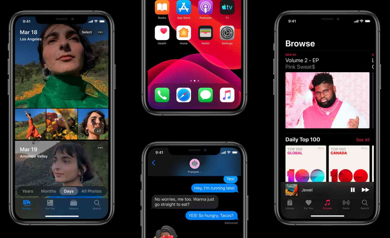
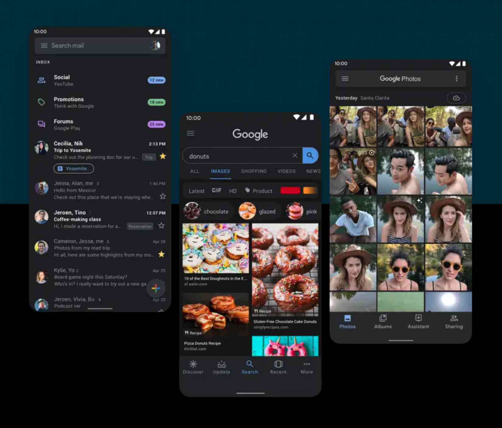
Darkmode is everywhere–but why?

2019 is officially the year of 'dark mode' coming to every device and app you own. But I find myself torn, because it feels like such a non-event, given a ludicrous amount of fanfare, so what the heck is really going on?
If you missed the boat and it's not immediately obvious what dark mode is, allow me to explain: it's an option that allows you to choose a 'darker' theme in some software, nothing more. Essentially, it's a single theme, and it's easier on the eyes.
Both Apple and Google tout dark mode as flagship features of their operating system updates for 2019, iOS 13 and Android 10. Slack received dark mode today, and received wall-to-wall press coverage for it... but why?
On one hand, dark mode is exciting for anyone that's experienced the blinding light of 1,000 suns eminating from their phones when picked up in the middle of the night. On the other hand, it feels like we're getting tossed a lazy bone: why not full-on theming, or actual customization options?
That's the crux of why dark mode is exciting: because it's at least some control over the experience, after the better part of a decade has been spent removing customization options for consumers like you and I.
In the earliest days of desktop operating systems and the internet itself, theming was the norm, not the exception. On some websites, like MySpace, you could add custom CSS and do what you like. The dawn of Facebook, and the modern 'Software as a Service' tool, however, changed that equation: one size fits all reduced complexity, and made it easier for everyone to use.

That came at the cost of all customization essentially stripped away, and it's something that's been stripped from almost every piece of modern software. Windows still lets users choose a color accent, but there's no custom themeing anymore. Mobile devices don't allow custom themes (with the exception of the magical Android customization world).
We lost control over how our devices looked and felt, with them merging into a monoculture: design became a one-size-fits-all exercise, with little flexibility involved, to keep things simple.
Dark mode is exciting, I suspect, because of its miniscule utility, yes, but a different phenomenon instead: a sense of control over our devices again. It's a taste of the past, in which you could choose a look that suits you, and that's why people have latched onto it so vehemently.
It's also a symbol of tech coming full circle: we've done all of the hard stuff, and there's few truly ground-breaking features anymore that will compell users to upgrade their operating system. Dark mode will, however, and that's why it's here.
I'm not saying I hate dark mode, because I definitely enable it enthusiastically whenever I can get it... but I think it's a symbol of something we lost, and while I'm glad dark mode is here, it makes me sad to think of how good things were back when we had control (and choice).
Tab Dump
Apple will relax some (but not all) of its requirements around "Sign in with Apple"
One of the more controversial features launching with iOS 13 is Sign in with Apple, a feature that allows users to generate a disposable email address and password for signing up to a new app or service. Apple is requiring developers that use social signin, like Facebook Login, to also push its own system, which I'd argue was not very competitive. But, it's relaxing some of the requirements around that in certain cases.
The FBI is investigating a venture fund started by Peter Thiel for financial misconduct
Walmart's streaming service, Vudu, will launch family-friendly features
One of these features is Family Play which auto-skips sex scenes. No more awkward sitting-next-to-family-during-sex-scenes as teenagers, huh?
