It feels like I just switched to the Pixel 2, but a year’s already flown by: Google unveiled its Pixel 3 in New York City last week, and if I’m honest, I wasn’t expecting to care much about this year’s devices.
This is an incremental year at best, and I figured there wouldn’t be much to tempt me to upgrade — but I was utterly wrong, Pixel 3 is worth looking closely at.
After trying the Pixel 3 for a week, I’m genuinely taken aback by how much Google has refined the device in just a year, buffing out the rough edges and taking its in-house industrial design game to new heights.
Google has taken its hardware efforts from geek-focused experiments to a powerhouse of innovative design, and high-quality smartphones, in just three years.
Not only does Pixel 3 look and feel better, there are also meaningful improvements that make the upgrade worth considering. I started out writing this review thinking it would be simple but wound up realizing there’s so much going on beyond the surface that Pixel 3 matters in a more significant way than I’d assume.
On a year that seemed like there wouldn't be much to say, I'm flabbergasted by just how many things there are to cover, and excited that even over my humble Pixel 2 XL, I could be tempted to make the upgrade. Pixel 3, for an incremental upgrade, is a monumental step forward for Google's smartphone efforts.
I don't think a week is enough time to tell you every possible thing about a phone, but I've done the best to unpack just how much is going on with this new device, and plan to update this post going forward as I discover new features, quirks or surprises.
A couple of warnings before we go on: the Pixel 3 I have is final software, with some preview builds of the applications that'll land on the production devices come October 18. There are more app updates to add missing features on the way, such as Night Shot, which I'll discuss where relevant, so I couldn't review those bits at the time of writing.
For an experimental, shorter way to read this review, try my new Story format here to tap through the key points, otherwise read on.
Big or small
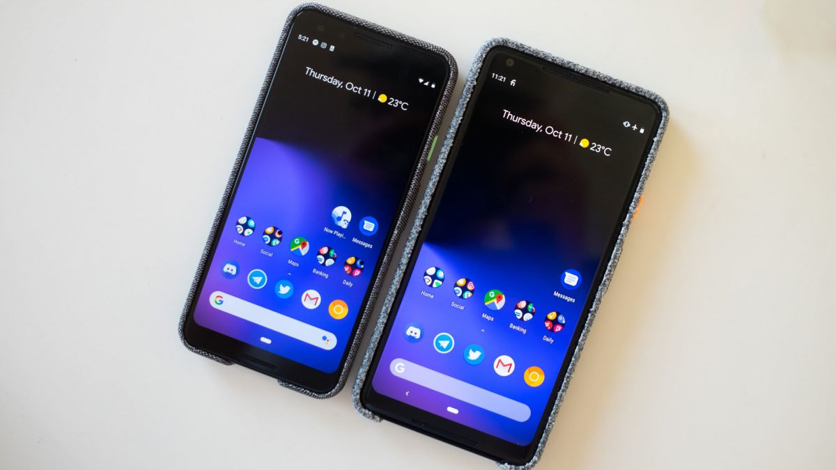
I do notch want to talk about it at length, but this year’s Pixel 3 lineup is defined by that absolute unit of a notch on the XL model this year. It's thicc at best, and confusing at worst: why does it exist?
It’s a design decision that allows Google to stretch the screen to the upper edge of the phone, but inexplicably retains the chin on the display and fails to add much value to the experience, unlike the TrueDepth sensor in the iPhone responsible for its notch.
The truly bizarre part about that notch isn’t that it’s there at all, but that Google could have implemented it in a way that made the operating system embrace it. Instead, it’s just entirely in the way, all the time, bumping content and the status bar all over the place rather than adding value.
I can accept that Google wanted to make this compromise, but I struggle to understand how it didn’t leverage software to better handle how outrageously oversized the notch on this thing really is.
Unsurprisingly, the community stepped up and designed a decent solution: make the upper corners of the display dark and tucks away the notifications there, disguising the notch and making it look seamless, which feels better than any of the first-party notch makers have done to date.
In my mind, this wrote off the Pixel 3 XL immediately as something I’d purchase, even though I already used the bigger model last year. The notch is one factor, but what drove me to the smaller model this year is that it’s received the best features of the Pixel 2 XL, without any of the drawbacks.
This year, the smaller model of Pixel 3 got the rounded screen, which stretches it to be larger inside the same frame while stopping short of adding a notch. It feels balanced, and most of all, comfortable in hand -- the 2 XL was giving me hand cramp as it was, so the smaller model was a welcome change for me. Using the larger device, by comparison, feels like holding a surfboard now.
I spent a bunch of time with the 3 XL in New York, but was only able to use the smaller device for an extended amount of time. This review largely focuses on the smaller device, which is much more interesting to me as a result.
Refinement everywhere you look
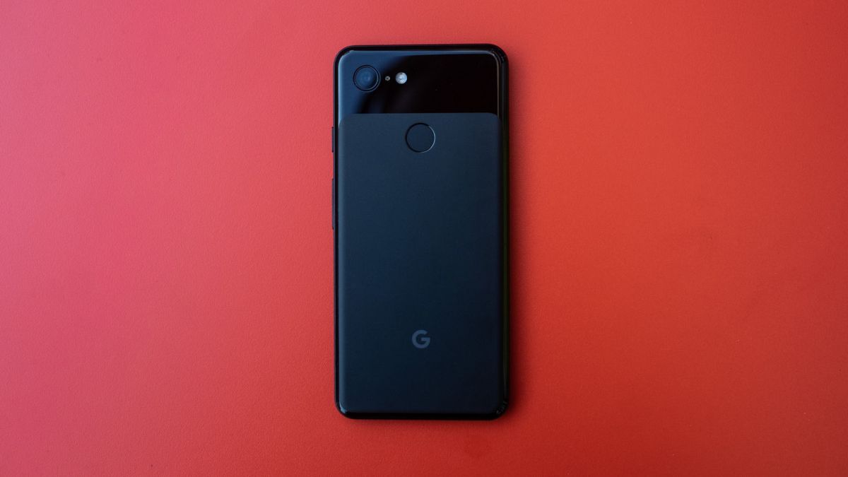
I watched the Pixel keynote, saw all the leaks, and found myself wondering if this was a device I wanted. Maybe I’d wait out 2019, and see what Pixel 4 looked like? Then I picked up the Pixel 3, and that went out the window: it’s lovely.
The nuance is in just how well Google has refined the hardware. It seems minor in photos... then you hold a Pixel 3: it’s weightier, better proportioned, and the display is out of this world. Everything about the hardware design has been considered, refined, and improved upon over 2017. It’s lovely!
Adding a glass back and the glossy rounded edges makes Pixel 3 feel as close to an iPhone than ever before, and that’s a compliment: Apple’s hardware design is stellar, and Google has designed hardware that’s on-par without being a clone.
It’s the most premium non-iPhone flagship out there, and it’s a feat that no other manufacturer has pulled off -- but Google did it after just three years. It feels great in the hand, especially next to the Pixel 2, which feels like a plastic knockoff after you've held both at once.
Notably unlike the iPhone 8, which is made of the slipperiest materials known to humanity, the Pixel 3 has a bit more grip thanks to the textured glass that sits nicely in your hand.
Adding a glass back comes with many benefits and compromises. It looks and feels great while allowing for wireless charging for the first time. On the downside, it’ll be so much easier to shatter the back than previously, driving the cost (and likeliness) of repair up, and it can get gooped up with fingerprints every now and then.
I always enjoyed the aluminum-backed Pixel 2 XL, because it was light and felt far less fragile. But, I do prefer how the Pixel 3 feels in your hand. If anything, I’m sad that switching to a glass back means saying farewell to the lovely ‘panda’ color combination from 2017, a design that wasn’t possible with the Pixel 3 being made from a sheet of glass, rather than two distinct materials.
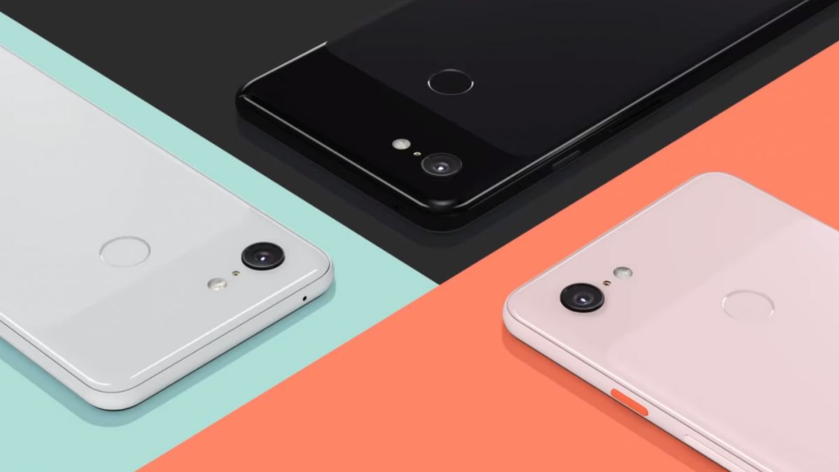
That means new colors, too: there's Just Black (which I tested), Not Pink, and Clearly White. Quirky naming aside, the pink phone is absolutely the one to get this year, it's beautiful, and none of the photos out there do it justice! It's such a quirky, pastel set of colors that I adore it, because it's set apart so distinctly from Apple's metallic colors in its new lineup.
The display is another improvement I noticed almost immediately: it’s beautiful. Compared with the boxed-in square of the smaller Pixel 2 last year, it feels like it should’ve been this way all along; I have a soft spot for rounded corners, which look lovely on this phone. It’s brighter, with a better contrast ratio, and damn it’s one of the most vibrant screens I’ve ever seen on a smartphone.
It’s worth noting that Pixel 2 XL’s display was reportedly fraught with issues, but I had no such problems with mine. It looked great, and produced good color, but Pixel 3’s display is next level across the board. It’s also one of only a few devices that’s high dynamic range (HDR) ready so that you can enjoy HDR video from YouTube and Netflix on day one.
Pixel Stand has to be one of my favorite new things that makes the Pixel 3 worth upgrading for, which was a total surprise. I didn’t really ‘get’ wireless charging in the past, particularly given that fast charging allowed the device to get a full charge in less than an hour.
Oh my god, I was so wrong: wireless charging is magical, and Pixel Stand transforms the phone into the perfect nightstand, while still offering the quick charging experience.
There’s an array of wireless chargers out there, and Pixel 3 is Qi compliant, so it’ll work with basically everything you can find.
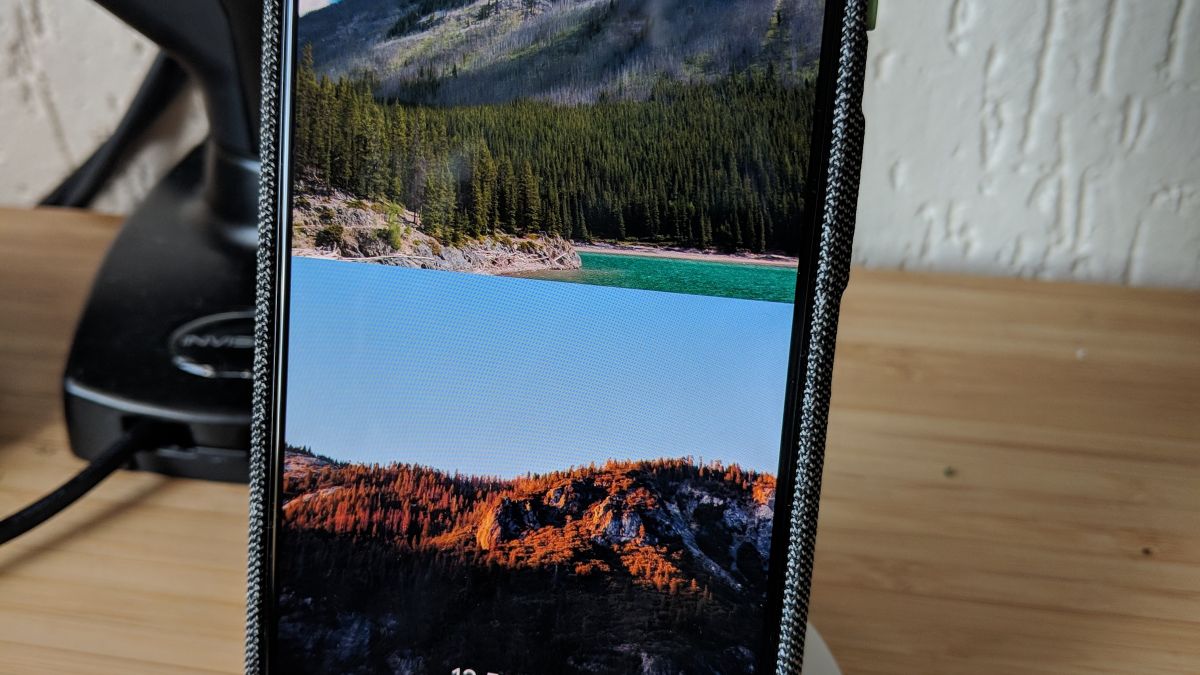
What makes Pixel Stand unique is that it holds the phone upright, pointed toward you, rather than flat, and modifies the interface to work better in this mode.
When it’s wirelessly charging in the stand, it’ll show an ambient clock on the display, with big buttons suggesting what you might want to do with assistant. Tap one of these, and they’re presented in a stand-friendly way, with big fonts and images.
My immediate thought here was that this seemed like it would be annoying at night, but Google considered that: a setting makes the phone’s display turn off when it’s dark and enables do not disturb mode automatically. This is so cool if you happen to read at night before heading to sleep; the screen fades out once you turn out the lights.
There’s a bunch of other great little stuff, too, such as a mode that subtly displays your favorite photos, and a sunrise alarm clock, which wakes you up gradually by fading the screen to full brightness before your alarm clock goes off (I was surprised to find that this worked really well for me, and actually woke me up).
I’m obsessed with having the Pixel Stand everywhere, the only limiting factor being the price. I want one on my desk, by my bed, and anywhere else I sit for an extended amount of time. It’s such a fantastic way to interact with your phone, and I hope Google continues to add new modes to it in the future. I’ll buy a bunch of these, for sure.
On this note, the battery on the Pixel 3 is next-level good: it’s an actual struggle to drain it to empty even if you’re using it constantly, all day. I’ve only spent a week with the phone, but despite using the smaller model, I’m able to squeeze out beyond a day of use without even thinking about it.
Even on exceptional days of usage, it still delivers: I went out with friends at around 8 AM, flew a drone for an hour with my phone, used Google Maps, took a bunch of photos, and got home at 6PM with around 27 percent battery left. That’s impressive!
I’ll share more data once I have it, but I was able to get 5 - 6 hours of screen on time, consistently, without thinking about it much. Goodbye, battery anxiety, and for everything else, I have this battery pack.
One last thing that’s a dramatic improvement over any Android phone, including the last generation Pixel: the haptic vibrations are so much better now. I don’t know if this is a thing anyone cares about outside of technology enthusiasts, but previous generations vibration motors created a ‘hollow’ vibration feeling, especially when compared to the iPhone.
Pixel 3 fixes that, and they’re on par with what you’d expect from a high-end phone. I noticed them immediately after unboxing, simply because they finally felt right.
THE BEST CAMERA (AGAIN)
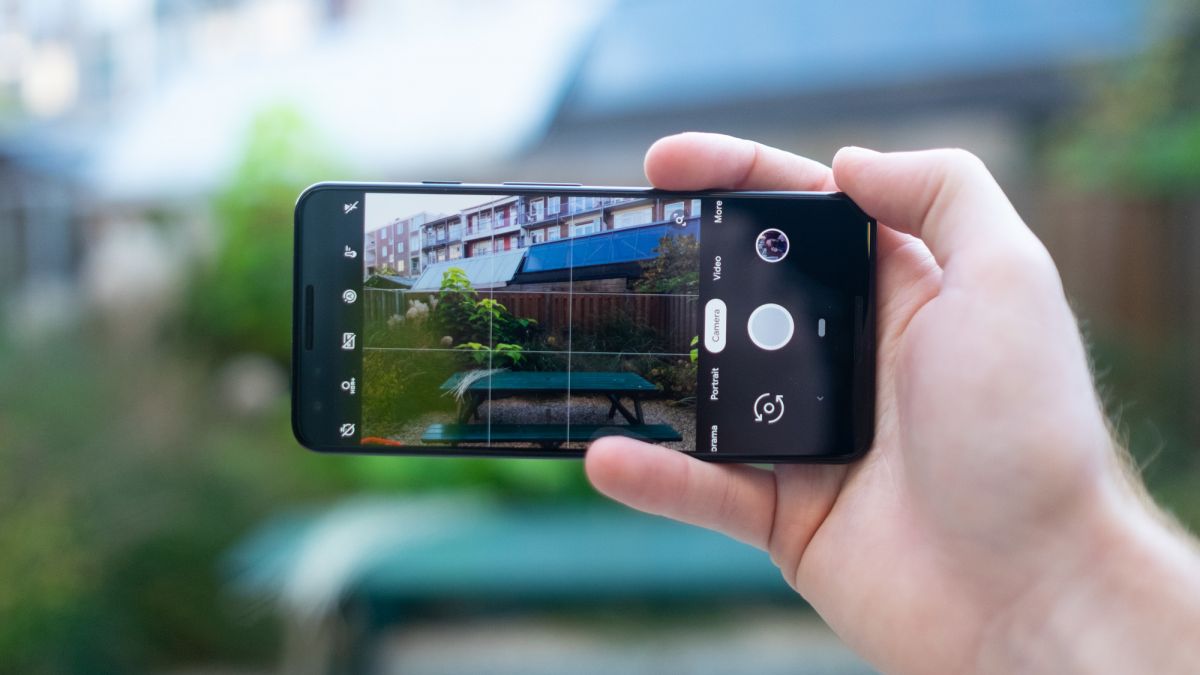
When I switched to Pixel 2 XL, my DSLR started gathering dust. Now, I think it'll rarely get picked up ever again.
Pixel 2 was the first smartphone I’d ever used that built up my trust enough to know it would nail every shot, and it quickly became my go-to camera. I stopped taking my DSLR on vacation, out and about, as well as to events. It turned out that the best camera was the one in my pocket all along.
Pixel 2 came out a year ago, and it’s no question that it still held the title as best smartphone camera, even after Apple refreshed the iPhone X in 2018. That alone is an admirable feat, and it was hard to imagine Pixel 3 pushing those boundaries much further, given that we’re reaching the point of diminishing returns on the hardware front now.
Google did it anyway. Pixel 3’s rear camera specifications are primarily the same on paper as last generation's, but thanks to software improvements and new AI-enabled features, it’s able to do much more. The front-facing camera, however, is where the majority of the notable hardware upgrades are: there’s now a wide-angle camera, alongside the traditional one.
This is wild to experience and is worth raving about: Google essentially built a selfie stick into a phone, but it’s better than that. The experience is magic: if you’re taking a selfie, and need more space for the background or something else; drag the slider to the left and boom it’s wide-angle. It’s seamless, and feels like magic because you can see so much more that it’s actually surprising!
I underestimated how much wide-angle cameras on the front would matter, but they’re magic. It makes taking selfies, or group selfies, fun all over again, and I have a feeling that this alone will drive many people toward the Pixel 3, particularly because the quality it outputs is so high.
The subtlety with Pixel 3, however, is that the age of ‘computational photography’ is here. The Pixel 3 uses machine learning across the board to create results that previously weren’t possible with sensors alone, and blowing every other camera out of the water at the same time.
Every time I’ve taken a photo on this device, it’s blown my mind. Every single shot, regardless of the situation, seems to come out fantastic. Overall, I’ve found that Pixel 3 is better at lighting the photo, faster to grab the shot, and reliably reproduces color without tapping all over the screen to get things right.
A nice addition here, 'Top Shot' mode, reduces any anxiety further by buffering a few seconds before and after the photo so you can grab the moment later, should you miss it.
In the galleries that follow, all photos are untouched, directly out of the Google Pixel 3. To view the high-resolution, uncompressed photo tap or click on anything you see!


