I've been hunting for a great MacBook Pro replacement since early 2017 and while I've been happy with my switch to a desktop machine at home, it's been an interesting journey trying to find something that's on the same all-around hardware and software experience on the laptop side.
Over the past year I've spent time with the Razer Blade, Dell XPS 15 and the Eve V, which are all stellar machines, but I didn't quite feel at home yet. These are fantastic machines that do the job well, but always left something wanting, which I figured I'd need to settle for.
I'm back to say I was wrong, and I've found a machine that not only matches Apple's standard of hardware quality, but goes far beyond it to demonstrate how a laptop of the future should work.
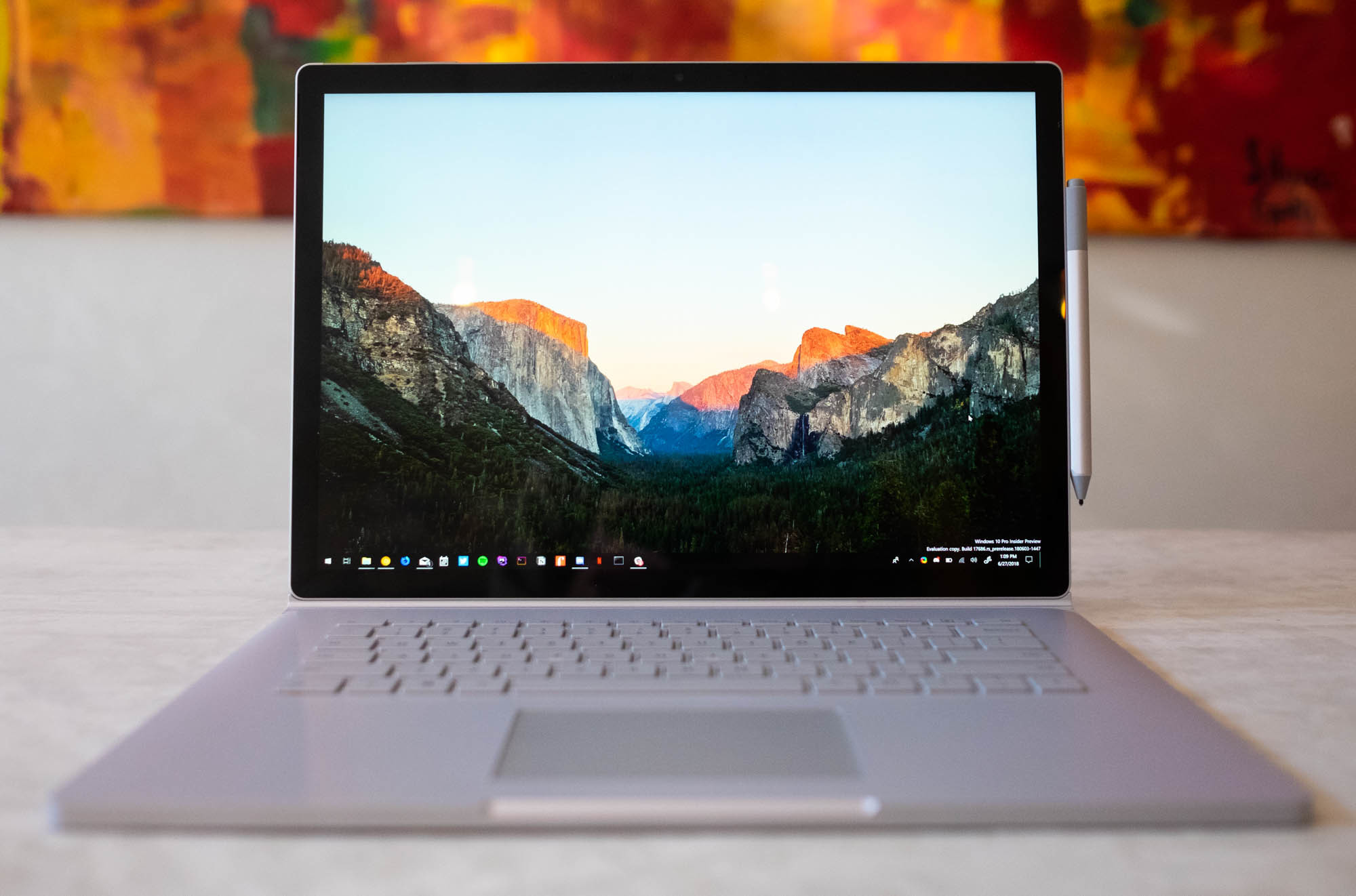
That machine is the 15-inch Surface Book 2 and somehow Microsoft has made the 2-in-1 that Apple should've been building all along, to the same level of quality I'd expect from anyone other than Microsoft.
I've used the Surface Book 2 as my daily computer for three months now and it's consistently blown me away with how well considered it is across the board, how great the software works and has completely converted me into the touchscreen laptop camp.
I'm not your typical reviewer but rather a person who needs more out of their machines than most.
I'm a software developer and UX writer who spends my days either in a text editor or building and debugging PHP applications (including my own) in an IDE. I needed a machine that could offer enough power to get shit done, but is lightweight and flexible enough to do other things, like watch movies and do some light gaming.
I don't want a serious gaming monstrosity, I just desired something that can do the job well, had great build quality and could run the Unix-based tools I need to use to get through the day while offering reasonable battery life. It's a tall order, but should be feasible.
While a touch screen, ink-compatibility and other things weren't really on my list, the Surface Book came onto my radar when it was first released a few years back by just how sheer adaptable it is. That was a laptop of the future, and it looked promising, but at the time only came in a 13-inch version.
When Microsoft introduced the larger 15-inch version in late 2017 with a 6GB GTX 1060 graphics card, my interest was piqued: could this be the Mac-quality alternative I was looking for? At the time, it wasn't available in Europe at the time so I went with the XPS 15.
On a recent trip to the US, however, I decided to get one to try it out and see if it lives up to the hype. Here's the very long-winded detail of how I fell in love with a convertible, and why I’m now using it as my daily driver.
High quality hardware
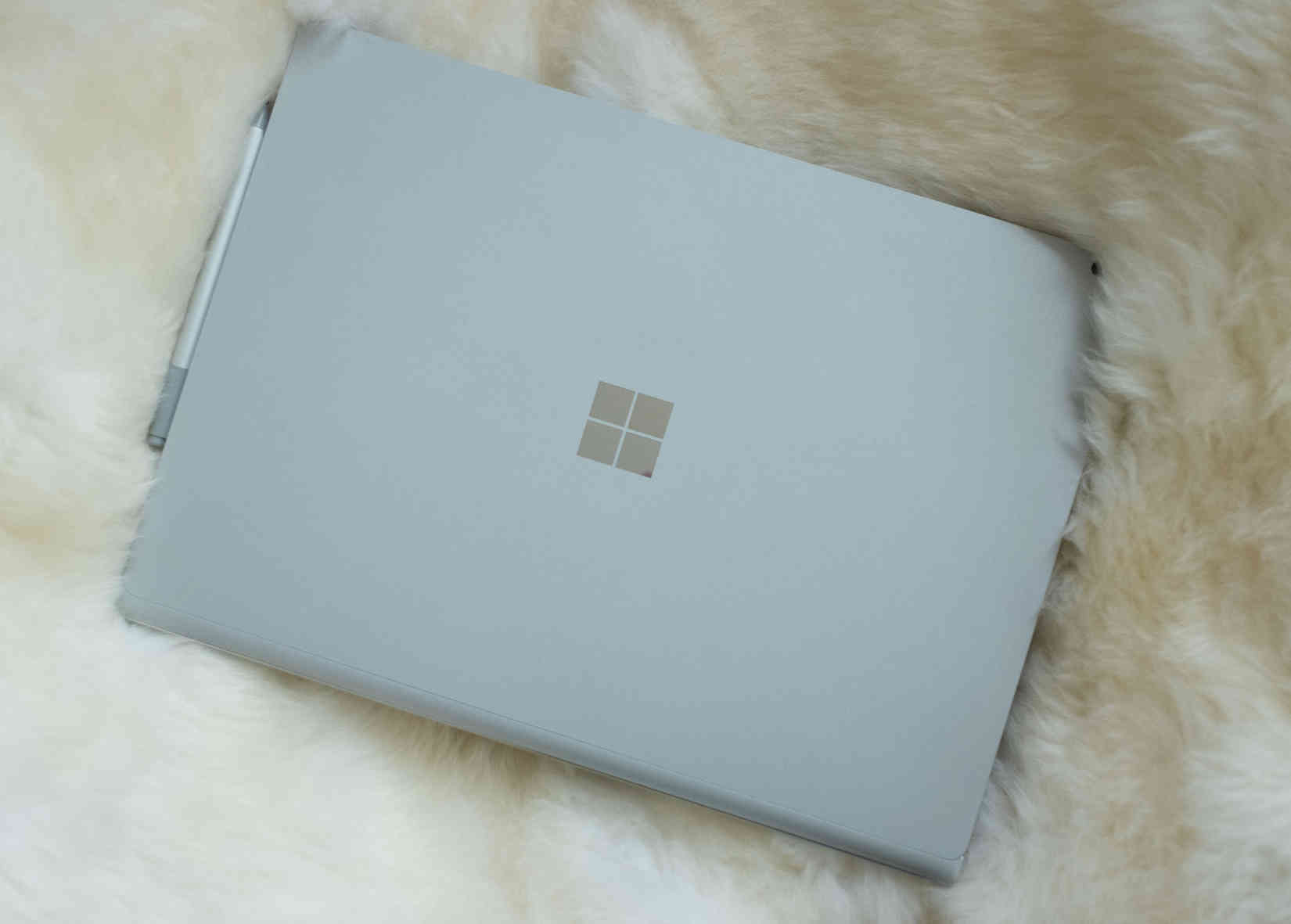
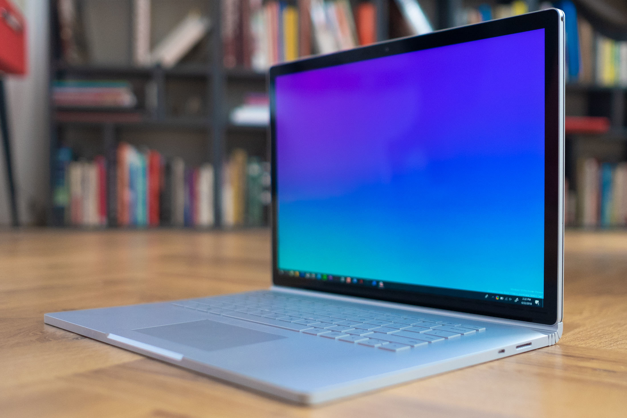
The Surface Book 2 is one of the cleanest, beautiful pieces of hardware design I’ve seen in recent times, and I love that hardware is getting weird again in all sorts of ways. Microsoft deserves more kudos for pulling this off, because it's fabulous to look at and still functional without compromising on the aesthetic.
While the hinge aesthetic itself on this laptop might be incredibly divisive, I really love the element of quirkiness it adds — personality for a laptop design language that’s traditionally been made up of boring rectangles.
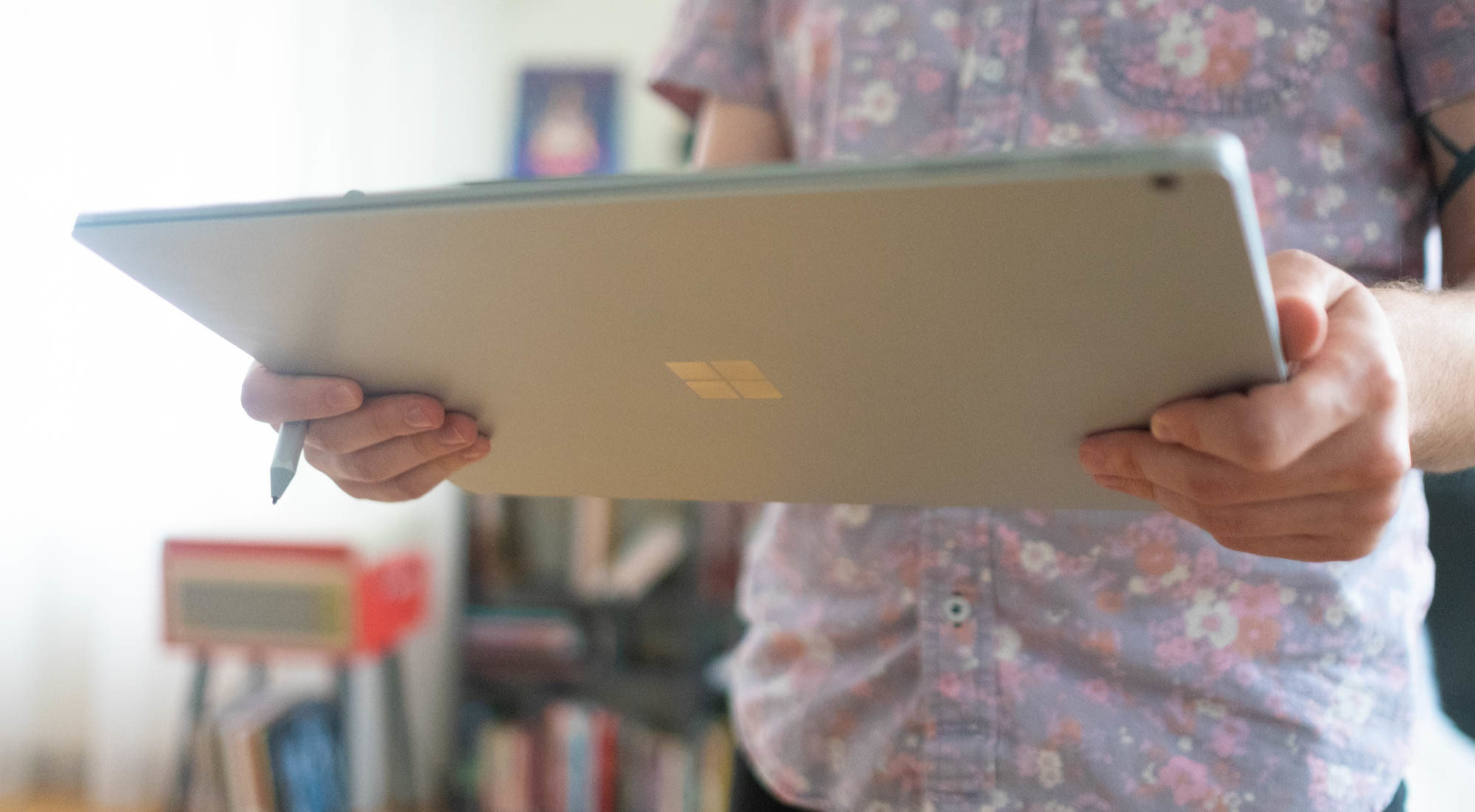
The body itself is encased in magnesium that's satisfying to touch and stands out from anything I've used before it. The casing is never too cold to the touch while feeling soft, and doesn’t get finger goop all over it like the Dell XPS 15 did.
It feels premium in the hand, but sturdy enough to last, and doesn't feel cheap. There's no flimsy bits at all, just end-to-end metal, without logos or stickers to tarnish it.
Display
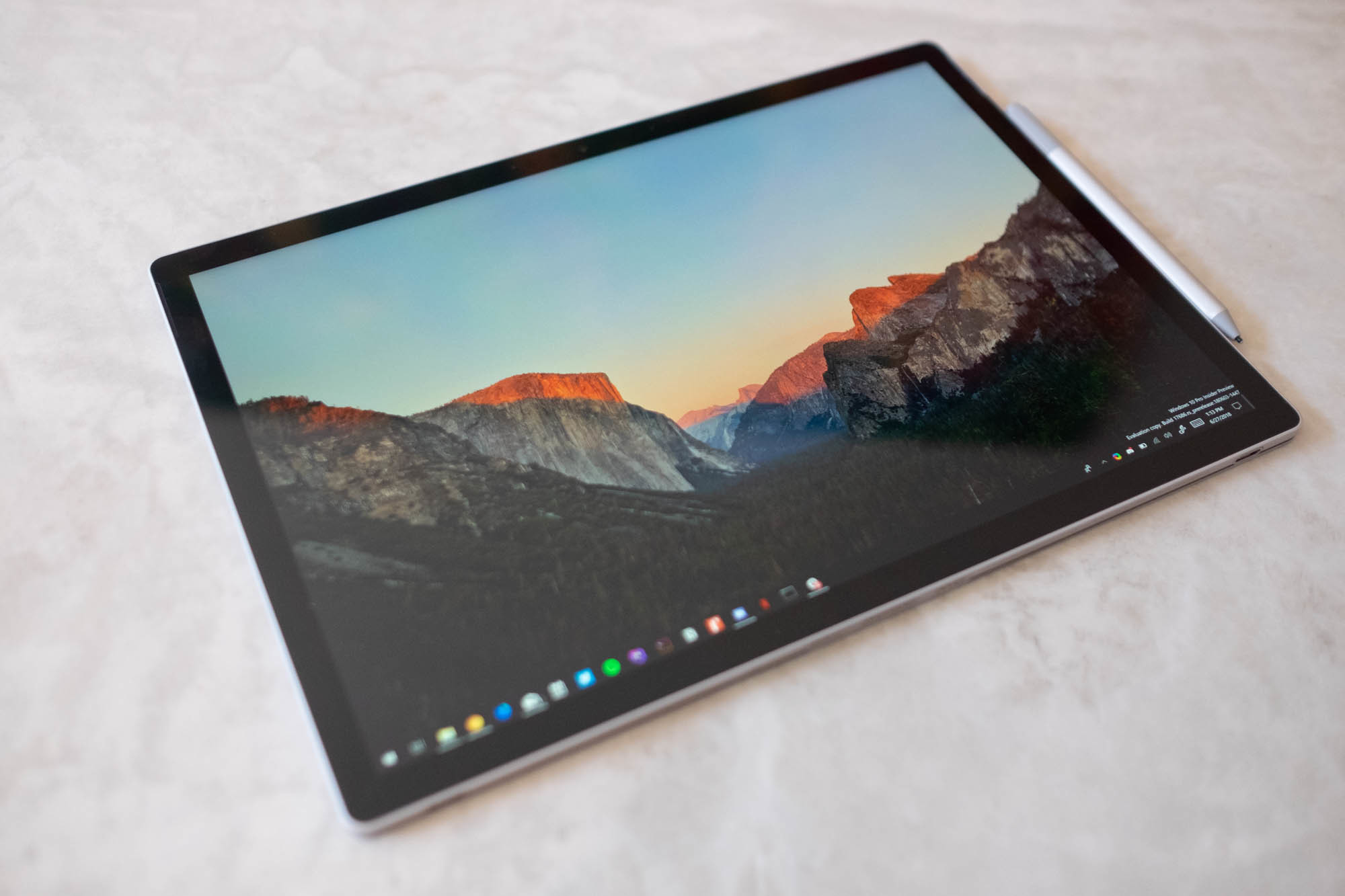
Hands down, the screen is one of the best in the industry and lives up to what you'd hope only out of a Retina display, while still pushing the boundaries.
The display is able to produce rich colors, a ton of brightness and looks fricking great. If you care about pixels as much as I do, and you want to get as high resolution for working on the go as possible, look no further, but it gets better.
One reason I had interest in this device in the first place was the 3240 x 2160 resolution, which is a quirky 3:2 in a world of wide, vertically-limited 16:9 aspect ratio laptops.
Such a resolution, however, is far better than your average laptop for one big reason: you get a bunch more vertical screen real estate to play with, which I love, because I spend most of my day working on this thing, not watching widescreen movies.
The vertical space on a MacBook or XPS is always extremely limited to the point that I’d always preferred putting the dock on the left of the screen to scrape out as much as possible, so using the Surface Book 2 is like stepping into a room with incredibly high ceilings for the first time: liberating.
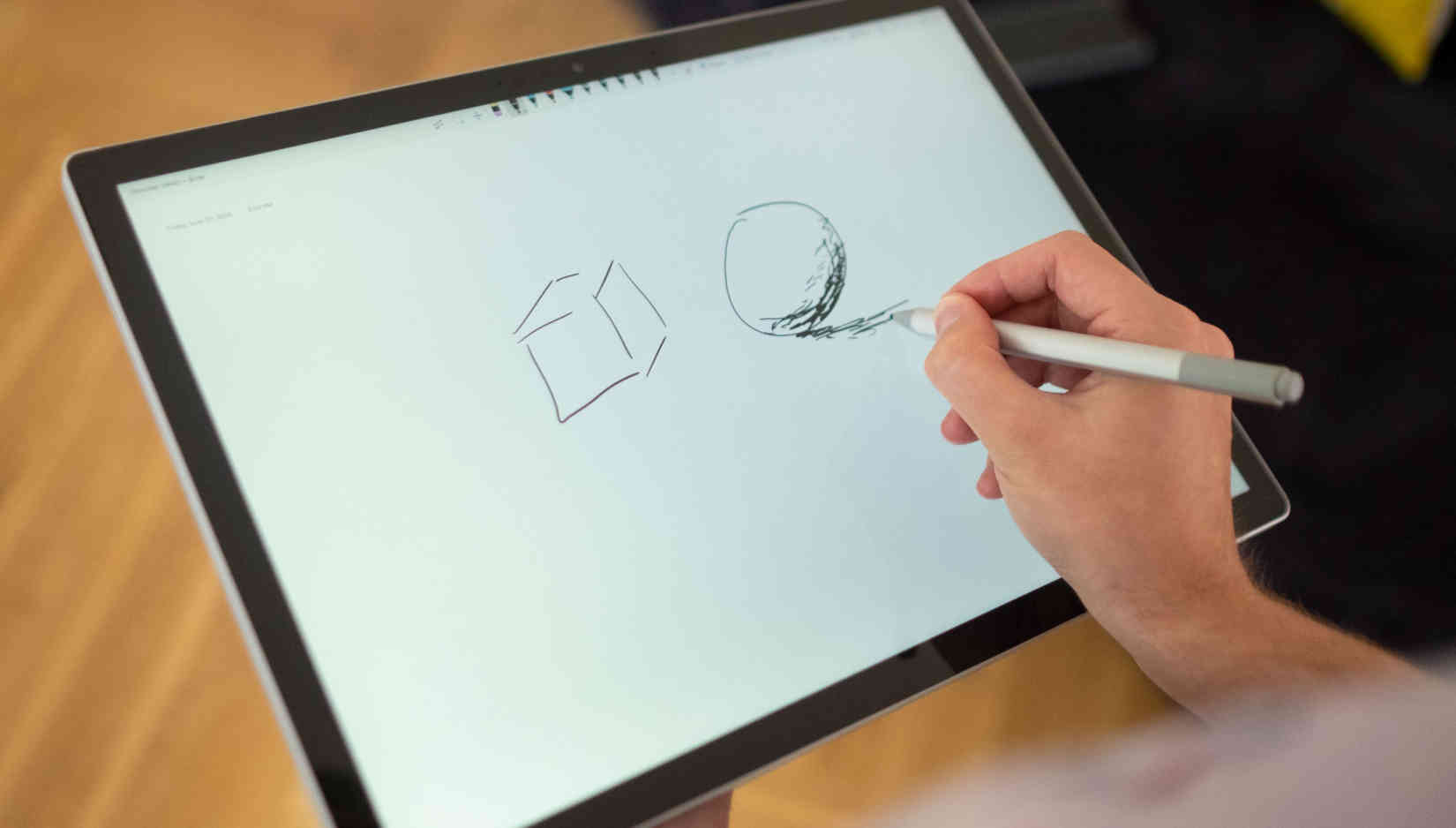
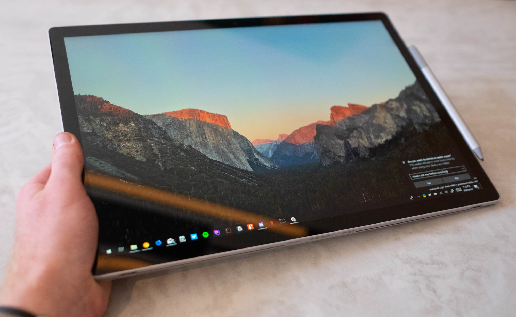
The 15-inch size of the screen works incredibly well in practice, surprisingly in tablet mode, because it's like a slightly oversized piece of A4 paper. That said, if you thought that the iPad Pro looked stupid big, you're now in oversized clipboard territory. Yeah, it’s stupid big, but the size of the canvas lends itself to taking detailed notes, drawing doodles or sketching out diagrams with enough space to really use it.
At first the size made me embarrassed to use tablet mode public, but then I got to the point where it just felt freeing: enough space to actually do the pen justice, and certainly enough to fall in love with it over, say, a Wacom tablet if you happen to be an illustrator.
Keyboard / trackpad
The biggest stumbling point for PC makers has traditionally been the trackpad and keyboard, which are often either disappointing or downright deal breakers for those looking to switch away from a MacBook.
The bar is high because Apple's been good at this for years and most PC makers' trackpads would trigger accidental scrolls, taps or even just outright barely work.
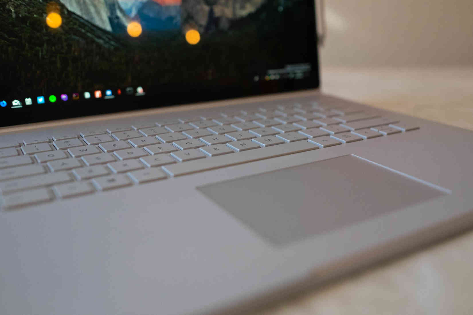
I am incredibly skeptical of any PC for that reason, but was pleasantly surprised by how not terrible the trackpad and keyboard are. In fact, it was surprising to me that the trackpad is beyond great in practice. It just works, the way you'd expect, and I'm happy to have nothing else to say there.
It’s the first time I’ve found Apple-level trackpad quality on any other machine and it’s just delightful.
If, like me, you're coming from the Macbook Pro with the butterfly keyboard, I promise that typing on this thing is salve for your butterfly-keyboard wounds: it’s got a perfect amount of travel, feels comfortable to use and doesn’t sound like you’re typing on a hollow piece of wood.
In other words, I’m really convinced that Microsoft finally nailed the combination of hardware and software needed to make a laptop that wasn’t infuriating to use. Input is so key to getting this right, and the combination is finally reaching the bar that's been consistently missed for years.
The Surface Book 2 might be a bold convertible, but it’s not hindered by compromises like crappy text input — it’s a damn delight to use on a daily basis.
No dongle required
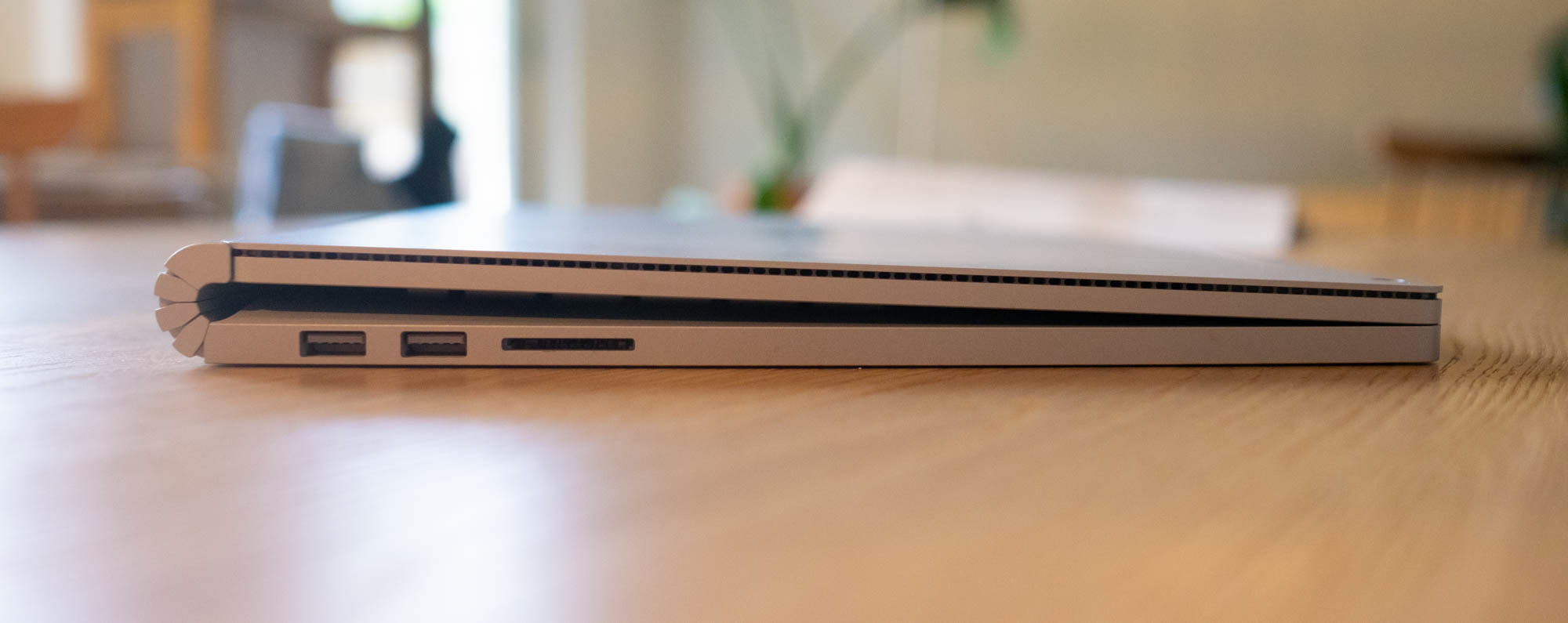
For connectivity, if you’re comparing to the MacBook Pro the Surface Book 2 is basically a home-run: you get two USB 3.0 ports, a Magsafe charger (!), a USB-C port (which can also be used for charging), and an SD slot.
In other words, it’s perfect, and you can basically stop with the dongle hellscape that is 2018 with the Surface Book, because it solves it by just being pragmatic. What Microsoft has done with the combination of ports here is refreshing, with a caveat that we'll discuss later:
- There's a magnetic charging port which does a lot more than just charge: it's also able to be used for connectivity. Add a Surface Dock, which uses the same port and you'll get charging, displays, networking and more.
- Having a native SD slot was something I'd actually missed, so having it back is even better for those occasions where you need to quickly offload a card.
- The audio jack is at the top right of the screen which is an adjustment because it means your cable will be suspended from the right of your display. This is necessary so you can still listen to audio in tablet mode.
- The charging ports are also inexplicably on the right-hand side of the base, where every other laptop in existence has it on the left-side — this results in an annoying wire floating around right next to your mouse if you don't arrange it carefully.
- We have USB-C connectivity, which is a welcome improvement with a catch we'll go over later on in this piece.
Split it up
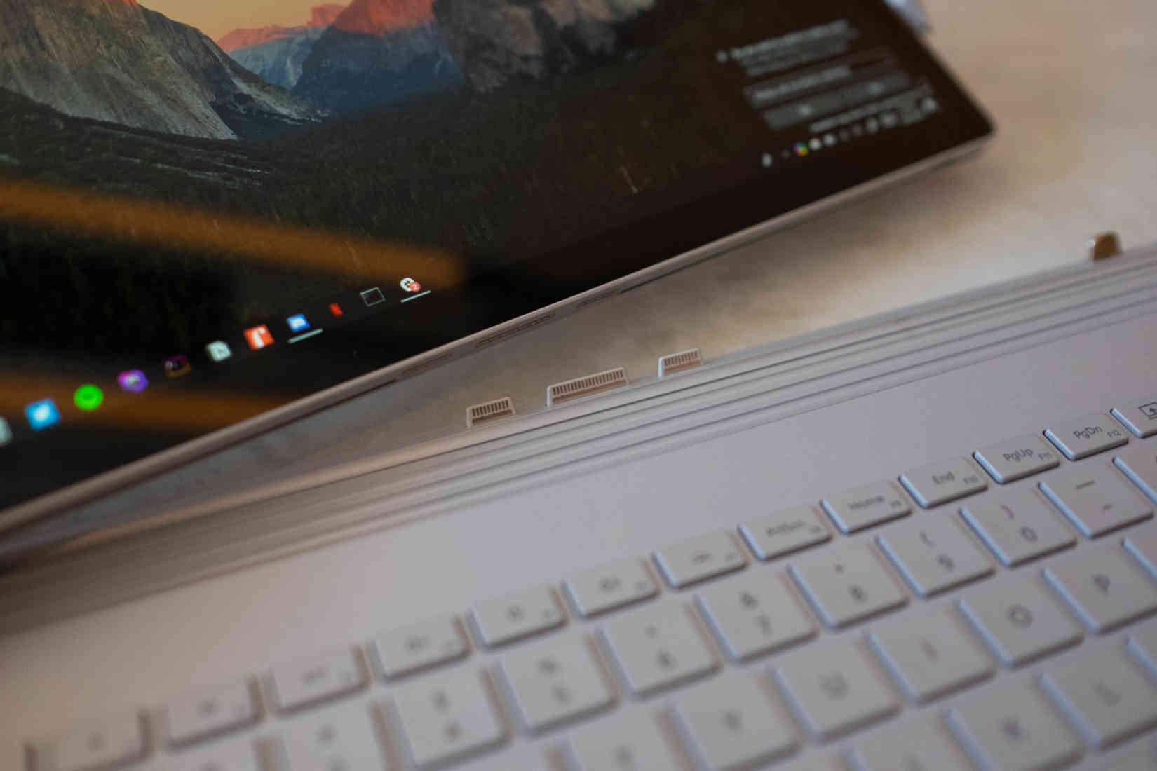
One of the Surface Book 2's marketing angles is that it's a full-on computer with a wild secret superpower: it's a full-on tablet too. All you need to do is push a button on the top right of the keyboard to eject the screen, and boom, you've got a tablet computer without giving up any of the conveniences of your full computer.
How Microsoft actually pulled this off, in practice, is impressive: the bulk of the Surface Book’s computing power is inside the display, as are the speakers and headphone jack. In the keyboard you’ve got a bunch of ports, a huge battery and a high-end graphics card, the nVidia GTX 1060 — if you pop off the screen, it’s a whole computer, without any compromises. Pop it back on and you’ve got a whole computer with a kick-ass graphics card.
Essentially, you’re getting the best of both worlds: you’ve got a great tablet computer like the iPad Pro, mixed with a laptop like the MacBook Pro. This seems like a gimmick on the surface, but it's a life changing feature that's totally undersold: I use both laptop and tablet mode daily, and it's totally transformed my workflow.
I'm a full-time freelance marketing and UX writer, so I'm often working in-person with clients in person. Being able to pop off my keyboard and write directly on the screen when we're brainstorming to draw all over a screenshot helps a lot, but giving remote clients feedback with the tap of the pen eraser is incredible for getting the message across in one go.
I often catch myself quickly snapping a screenshot, drawing on it, and flicking it off with the native Mail app for feedback, or drawing up a wireframe to show how we could use copy and layout better, which saves writing out a few hundred words on a regular basis.
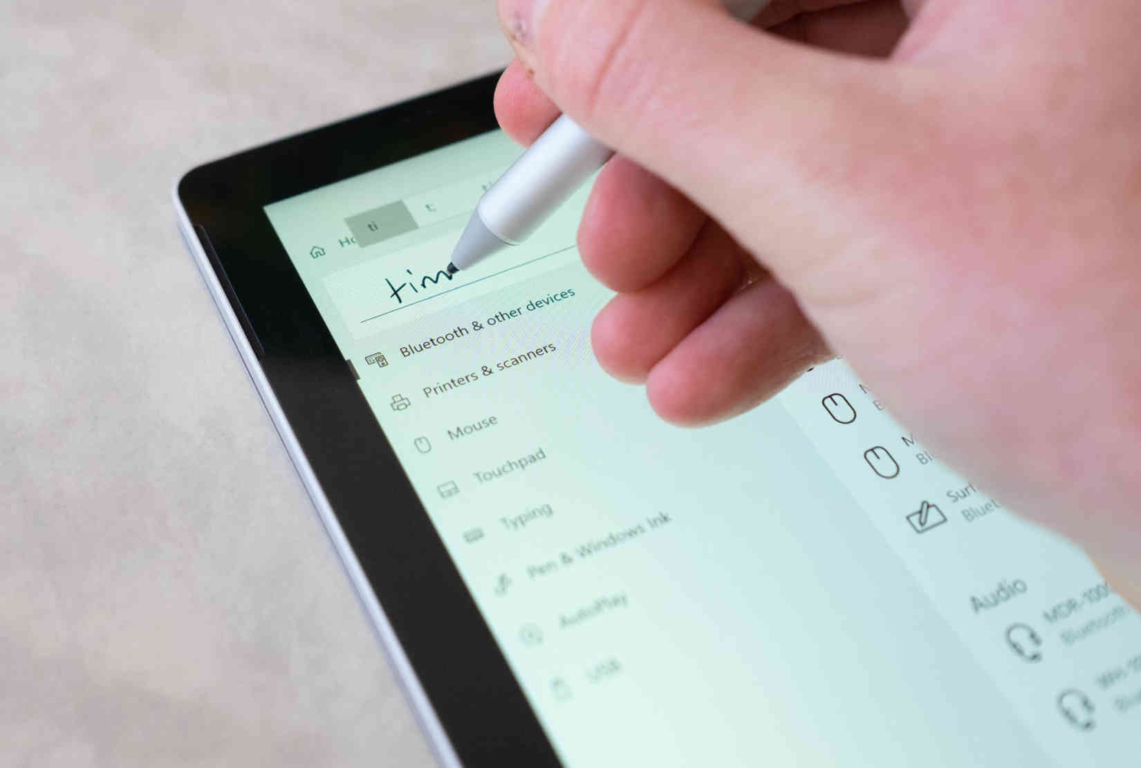
My worries about the transition from a desktop workflow to a tablet one are a relic from the days of Windows 8, where you were stuck in a weird tablet-interface land all the time. It felt forced at best.
Microsoft has done a great job of fixing that, and now seamlessly hands you off into a touch-friendly mode when you're using fingers or a pen, and a mouse-friendly interface when using the laptop format — and if you prefer, it can ask you which mode you want to be in when it’s ready to switch between them.
I’ve spent a ton of time with the iPad Pro and the Apple Pencil. They're incredible devices but constantly remind you of their own limitations as you're using them. The Surface Book is so much more powerful because it's already a part of your workflow.
You don't need some other device in there to get a specific task done, or to try and make the iPad Pro a serious computer: it's already in your backpack and it’s the same one you’re already using all day, just push the eject button to switch gears.
Microsoft spent so much time with the stylus to get it just right so they could compete. That's another thing I was initially skeptical of because since the Windows XP era support for ink support on Windows has been underwhelming, but it's come a long way.
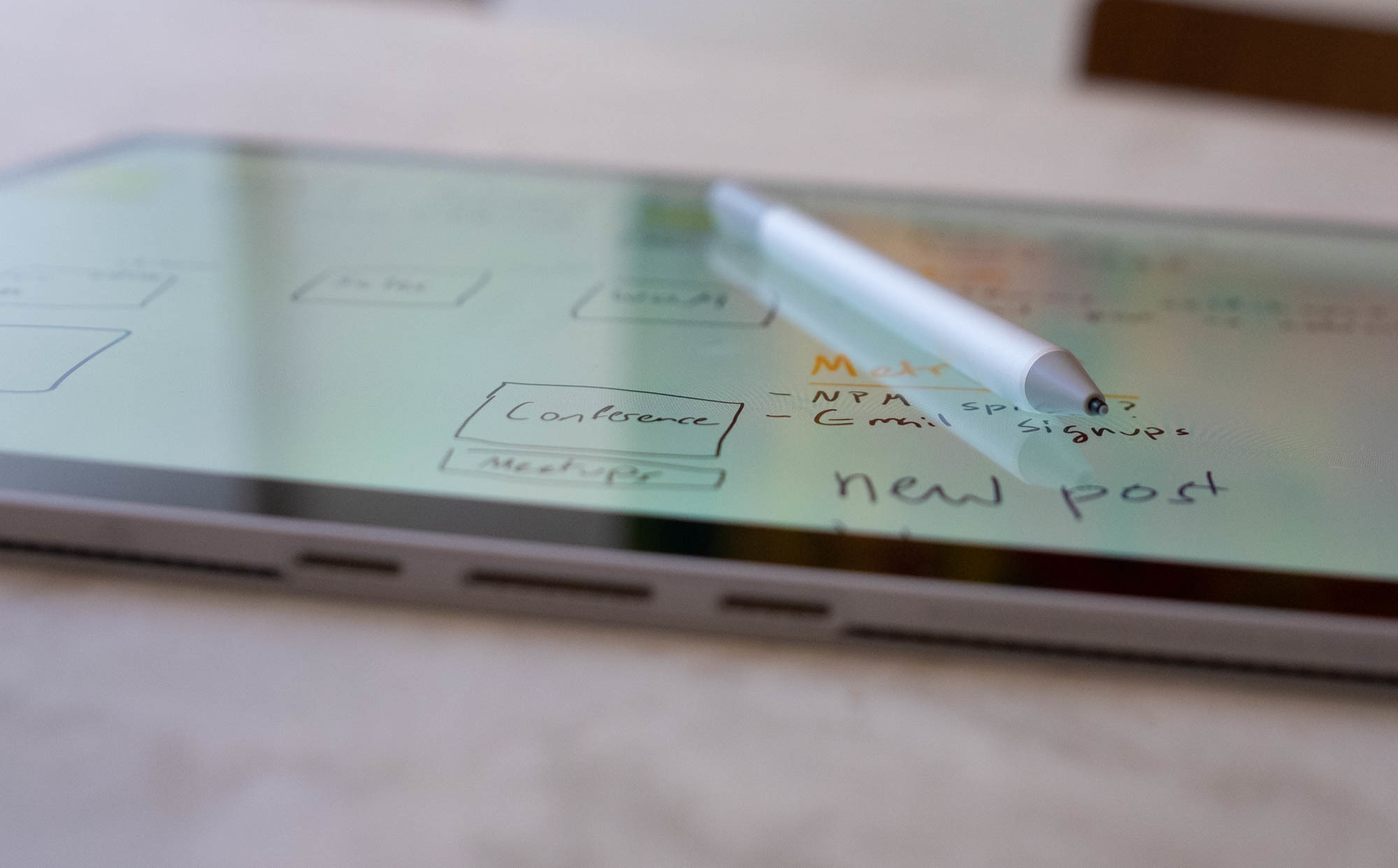
The response time on the pen is just as good as the iPad Pro, and the way it feels as it glides across the screen is really satisfying, as if you're writing on paper rather than jabbing a piece of plastic up on a slab of glass.
Microsoft has done a good job of making its pen more useful on a day-to-day basis as well:
- The eraser on the pen doubles as a button for launching an app, taking a screenshot or writing down a note, and can be configured based on the amount of times it's clicked. This is huge if you've popped the screen off and need to quickly write something down, and tapping once to scribble on a screenshot is something I've come to use regularly.
- The pen can magnetically attach to the screen on the left or the right, making it a lot harder to lose.
- OneNote, Microsoft's main app for taking notes and drawing scribbles, is really great at being a jot-pad for later. You can write as messy as you like, then select it later and it'll use handwriting recognition to convert it into text.
Microsoft calls all of these stylus-related features 'Windows Ink' and I can safely say I'm a skeptic turned into a believer here.
I have been pleasantly surprised by how good the pen is on Surface Book and how into writing/drawing on it I am, even if I'm a messy writer. pic.twitter.com/PmPmHzJLdM
— ⚡️ Owen (@ow) May 23, 2018
A note about touch
For years Apple has told us that MacBooks aren't for touching and there's no place for a stylus or finger in that form factor, but instead that an iPad is much better even though it basically ends up being exactly the same.
That transformability has other advantages too: if you're watching Netflix on a plane or in bed, you can pop off the screen, spin it around and you've got an instant tablet stand (instead of doing that shitty iPad 'smart' cover folding dance).
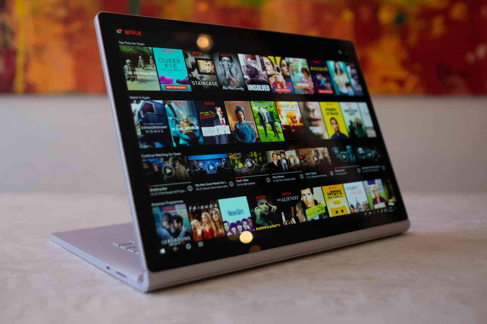
For cooking I just pop off the tablet and put it in easel mode to keep it clean while on the bench, or just ditch the keyboard altogether and use a cookbook stand.
Doing this in public is my favorite part of owning this computer because people can't believe what they're seeing — did that guy just pull the screen off his laptop? It’s a great conversation starter, because most people don't believe it.
The Surface Book 2 does everything the iPad Pro does in a single device, so you can write code as well as use it for notes, drawing and watching Netflix. Being able to transition like this feels like using this crazy machine from the distant future: just hit a button, pop off the screen, and keep working.
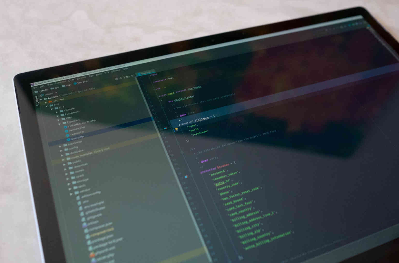
When you eject the screen, it's magical that it even works at all. How is it that I can watch Netflix on this huge, beautiful 15-inch screen that was a whole laptop a few seconds ago? Oh, and I can transition back to PHPStorm to check some code with a finger, too. It's absurd, and doesn't feel like it should be possible yet, but it boggles my mind consistently.
Touch in laptop mode isn’t something you’re going to use full time, but it’s a feature you’ll notice when it’s missing. I don’t actively touch my screen when I’m using my computer, but I subconsciously touch it to quickly shortcut my way around clicking on things.
Apple is full of nonsense when it says things at WWDC like it doesn’t believe laptops should have the ability to use touch because it results in a less than ideal experience — it couldn’t be further from the truth.
I've come to believe that Apple only says this because it wants to sell you iPads. As a result, Mac users are missing out on one of the shifts in computing I think that matters: the blurring of boundaries between different interaction models, from mouse to touch, all of the time.
Instead of moving the mouse to close a window, or quickly change the sound, I just tap it, and it’s so much easier to do that when you switch back to a MacBook, you’ll find yourself trying to tap the screen almost immediately.
I’m constantly getting confused when trying to use my partner’s MacBook and told off for touching the screen. It's a habit that sticks, and it’s only been a few months.
A few notes about how convertibility works in practice are worth raising here:
- To remove the screen, the keyboard has a dedicated eject button which takes about 1-2 seconds to check it's able to be removed, then it'll light up green.
- You might be worried about whether or not the keyboard could fall off the screen if holding it wrong. It can't; the mount is incredibly strong, as is the neck of the hinge, so there's no way to disconnect accidentally.
- Apps actively using the GTX 1060 can block the ejection of the keyboard until they're closed because if you were able to eject while in use, I assume bad things would happen.
- The ejection mechanism makes a slight click sound when releasing which scared me at first, but I got more comfortable with how well engineered the hinge was over time.
- Being able to do this without skipping a beat never gets old, and it's a game changer.
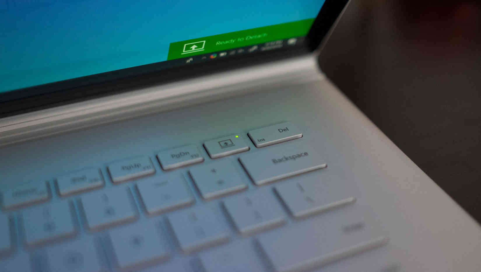
Consider me a convert on the all-in-one, which was just as surprising to me as it might be to you.
I love the touch screen, but I also unexpectedly love the inking, and would struggle to move away from it at this point. I’m a writer, but I usually prefer to jot notes by typing them out… and the Surface Book 2 completely turned that around.
While Apple’s trying to sell you a new version of the Corolla, Microsoft went and built the Ferrari of the future that turns into a jet plane when you feel like it.
Day to day
Over the last few years there was a big shift in how we think about our machines, and the type of form factors we were willing to use.
I recently realized that one of the big issues with the search for great ultra-powerful laptops, like the constant moaning about the MacBook Pro, is we’re asking so much more from them than the thermal envelope is able to deliver:
Everyone moans about how their MacBook isn't powerful enough but the real story is how desktop computers fell out of fashion and we're all throwing desktop workloads on thermally constrained, CPU-throttled laptops instead of just getting a desktop.
— ⚡️ Owen (@ow) June 5, 2018
Essentially, we all want laptops that can handle desktop-class workloads along with great battery life and a lightweight package. Most of us shifted from being chained to a beefy desktop PC when working and a laptop on the go to a different world: a single, powerful laptop that can do it all, both on the desk and on the go.
I think that expectation, often, is why people are disappointed in modern laptops — we’re pushing up against thermal limitations, imposed by the form factors we desire, and many of them just don’t live up to those demands.
Because of all of this, I was skeptical of how Microsoft packed a laptop and a tablet into the same device and could make this work. At a distance, I found myself wondering how any of this was possible given the form factor and limitations.
The Surface Book 2 that I'm using has an Intel i7-8650U quad-core processor, at 4.2GHz, 16 GB of RAM, a GTX 1060 with 6GB of memory and a 512GB hard drive, but it seems like that shouldn’t be feasible given the profile it's able to fit in.
First thing I did on it pic.twitter.com/z4z5b2IqFR
— ⚡️ Owen (@ow) May 7, 2018
I was wrong, and quickly discovered it’s a beast that’s capable of basically anything I can throw at it without skipping a beat. I play Fortnite and a bunch of other games on it in high graphics at 60Hz, then I can move back to PHPStorm and carry on with my day on the same damn machine.
Even better, it doesn’t sound like a 747 getting ready for takeoff like the Razer Blade does, a non-starter if you're regularly out and about. It also has a better form factor while not needing some external graphics card to pull off all of this.
The fact that it's in a computer that’s also a tablet is just the icing on the cake, a standout in a market of garish gaming laptops because it truly can do it all.
There are, however, some things worth raising here:
- There's a hard limitation of 16 GB of RAM even if you customize it, which feels low for such a high-end machine. When you’re doing serious work, with a bunch of Vagrant virtual machines and a few design files open, it’s easy to fill up that memory fast.
- Having a software battery slider is awesome because you can quickly throttle the CPU to get more battery life and limit the fan noise, or ramp it up for full-on productivity.
- I wasn't ever really able to bring the Surface Book to its knees. Fortnite worked on high graphics, at full near-4K resolution, and could pull 60 frames per second.
- If you disconnect the base, you're not going to have that GTX 1060. Not really an issue day to day, but if you were hoping to connect a dock to the tablet, then play Fortnite, that's not going to work.
The RAM issue is a real one, but Microsoft nailed the perfect machine for transitioning from serious work to play and back again, and that's special in a world where we'd otherwise need to carry an array of different devices to get things done.
Battery life
This is, of course, subjective, but I noted before getting the laptop that it has a serious amount of battery. There are two giant batteries onboard this laptop with one in the display, and another in the base, which means you should see north of 12 hours if you're not pushing it too hard.
I took a flight from San Francisco to Amsterdam and watched Netflix basically the whole time, about a 10 hour trip, and landed with about 39 percent in the tank. Your mileage may vary, but in my experience, that's bonkers.
My new workflow
I’ve found something of a perfect day-to-day setup through the use of Microsoft’s separate product, the Surface Dock, which is quite literally what I had hoped the MacBook’s USB-C situation would be in the first place: a single port that charges the laptop, does my displays and everything else.
While that’s possible on the USB-C side if you buy a $1,000+ display with USB-PD and a USB-C port, the Surface Dock is arguably a better solution because it uses the magnetic, simple Magsafe port to pull it off.
When I sit down at the office I plug in the Magsafe charger from the dock and boom: I’ve got a 4K 60Hz display, a bunch of USB stuff connected, and a 1Gbps ethernet connection up and running too. If you’re looking for a perfect personal-work transition, that has to be it, and it’s better than anything I ever found for my Mac.
Single cable life on the Surface Book makes co-working setup so much nicer 😍 pic.twitter.com/lTmGdj04Hc
— ⚡️ Owen (@ow) May 28, 2018
A fun side effect of the Surface Book’s convertibility is it lends itself to the desk setup quite well if you reverse the screen — you can put the keyboard out of the way at the back and use it as a second display right next to your primary one, which is a nice touch.
To make all of that convertibility work and still allow you to turn the laptop into a fully-functioning tablet, Microsoft did basically the opposite of what every other laptop maker does: it crammed almost all of the guts into the screen.
Literally everything is somewhere inside the screen panel, except the GTX 1060, which is a part of the keyboard base which is disconnected when in tablet-only mode for fairly obvious reasons. That change is the entire reason the hinge is so wildly different: it needs to be a high-speed data transfer interface, while still allowing the user to eject the tablet at a moment’s notice.
Also Surface Book is like the 🔑 flying computer pic.twitter.com/9dBhc2GEev
— ⚡️ Owen (@ow) May 12, 2018
To manage this, there’s a button on the keyboard to eject the tablet and throw you into touch-first mode. Tap the button, wait a second for the hinge to release, and grab it out of its slot — now you’ve got an enormous tablet.

This transition is magic — if a little disconcerting at first because you're pulling an expensive, enormous screen off of your laptop — but it works seamlessly and you can move from writing code to running a meeting or taking notes then back again, without skipping a beat.
What I love the most about this is if I’ve ejected the screen and am taking notes but want to quickly show off my development environment or some code I need help with, I can still do that! It’s the same machine, and all of my things are here!
The cherry on top of all of this is Windows Hello, an advanced facial recognition feature that makes it seamless to unlock the computer and 1Password instantly with a camera array on-par with Face ID in the iPhone X.
This has been a surprise improvement to my workflow that you can read more about here, because it removes the friction regardless of what way I'm using the hardware. Just wake up, and boom, you're in.
There are a few things that are side effects of hardware decisions that become apparent over time as you get used to the device worth highlighting:
- The screen is now where the cooling fans now live since the whole computer is there — you won’t hear them often, but it does mean the screen also gets warmer while the keyboard stays cool, an unexpected nicety if you play games a lot.
- The tablet part of the computer only has a minimal amount of ports: a 3.5mm headphone jack and a Magsafe charging port where the screen was formerly docked to the keyboard.
- Despite the lack of ports, you can still use a whole external screen and dock with the tablet part only by plugging in a Surface Dock which was a holy shit moment.
- If you reverse the display when at your desk, you get an extra screen without a keyboard in front of it; an unexpected nicety that I now do every day.
The most confusing decision about this computer is that the USB-C port is… not quite a full USB-C port. It looks like one, but is USB 3.1 which comes with a few annoying limitations, such as the ability to use USB-C displays, but the inability to do things like drive dual 4K displays at 60Hz over a single port on a machine that has more than enough guts to actually do so.
The reasoning for this seems to be to do with the four Thunderbolt lanes underneath being split in half across the USB-C port and that fancy Magsafe port, which allows the dock to work — but why not just make a USB-C dock instead? This is not something that degraded my work day, but it just seemed weird to have such a powerful machine limited by… a crappy port choice.
That USB-Cish port, in addition to the proprietary charging slot, is a welcome addition though. Instead of needing to carry the proprietary Magsafe charger you can actually choose how to charge it: use the official charger, or whatever's lying around.
I actually use a 15-inch MacBook Pro charger cable most of the time, because it’s compatible with my phone and Nintendo Switch too, and works just fine. Having an actual option is awesome, particularly after having already mourned the loss of Magsafe on the Mac.
Yeah, it basically means I can finally stop carrying a thousand stupid dongles.
The great divide
Most people that I showed the Surface to were impressed by what they saw, but almost always came back to the same thing: it doesn’t run macOS.
I’m increasingly frustrated by this because it’s almost always a misunderstanding of how far Windows 10 has come, and how compatible the workflow now is regardless of what you might do for a job. I suspect most people haven't touched Windows since years ago and it's time for a serious second look if so.
I’ve written about web development on Windows 10 before, but even since a year ago it’s come such a long way. The Bash on Windows environment is now so performant and well supported that you won’t even know the difference if you move from a MacBook, and Microsoft continues to improve it at an impressive clip.
Unless you’re using Xcode, your workflow will almost certainly move from macOS to Windows as a non-event: it’s that good now, and I spend most of my time living in the Bash environment without any problems — even with complicated situations like Symlinks inside Bash now actually working fully.
The next thing to come up, inevitably, is apps. macOS has had the upper-hand in attracting high quality developers for years, but over the past few years has diminished in popularity as the rise of Electron consumed almost everything out there. Microsoft, however, seems to have quietly built up a more compelling app store in the meantime.
The Windows Store now has the big ones you’d expect, like a native Netflix app with offline support (yes, really), Facebook Messenger, Spotify and so on, but the native apps, including Mail and Calendar are legitimately great too — to the point I use them on a daily basis.
Generally, the sticking point for designers is Sketch, which to date refuses to build a Windows client — a ridiculous, anti-user move that I hope eventually will cause people to reconsider it in their workflows.
As tools like Figma, Framer and Atomic have gained popularity, it’s possible to live without it, and I encourage almost all of my clients to switch to Figma because it’s cross-platform and opens up the design process to everyone in the company, regardless of whether they’re on Mac, Windows or a Chromebook, which needs to be more common.
Microsoft's betting on that shift to the web and now allows Progressive Web Apps, which work offline but offer a native-like experience, in the Windows Store. Long term this will likely have a big impact as more rich tools like Figma come along, and I believe this is the way forward over the opposite approach Apple is now pursuing.
Microsoft has pushed the Windows team to actually innovate in a space that seemed dead to find new ways of working, and it’s paying off. Features like Tab Sets which allow you to combine a web browser with, say, your calendar and the Sonos app, in a single, tabbed window are a game-changer for organizing by task.
With Microsoft’s efforts on the store, the new 'fluent' design language rolling out and new ideas for the desktop environment like Tab Sets, Windows has come a long way from the janky driver hell of yesteryear, and those that refuse to use it are missing out.
Wrap up
The crux of any search for the ‘perfect’ laptop is that in pursuit of perfection you’re almost certainly going to be disappointed as there will always be a compromise to be found. You can pick apart the Surface Book 2 and find one or two, but the sum of its parts is something special.
If you had told me that Microsoft would make a machine like this even four years ago, there’s no way I’d have believed you — it’s that good, and feels like something Apple should have made, but failed to do.
The Surface Book 2 is beyond great. It's a hit with a few tiny misses that make you scratch your head, but don’t ruin the experience. That’s an unfortunate distraction, because there are so many great things about it that it’s worth owning. It's much better than anything else I’ve tried despite those problems.
By focusing on making a device that transitions incredibly well from being a serious, work-focused laptop to one that can play games and render videos, then to a tablet that’s perfect for taking notes, Microsoft built something truly beyond the rest of the industry and I think will define the category for years to come.
I can’t sing the Surface Book 2’s praises enough; this is a laptop that’s superb in almost every way imaginable, and blurs the lines of what a laptop should actually be able to do.
This laptop is a developer's dream that can do so much more than just laptop stuff, which makes it exponentially more useful than I'd expected. The value of transitioning between modes can't be overstated, and you shouldn't settle for anything less at this point. Why carry two devices when you can use just one?
There’s no way I’ll go back to a MacBook again now that I know this exists, and if you’re looking for something else to try for your development workflow, or even if you're a designer, start with the Surface Book 2. You won’t be disappointed.
For more like this, check out my switching to Windows series:
